Transforming traditional dairy into a plant-based revolution🌱🌍
Comprihensive Case study with focus on what and how we worked durign this project
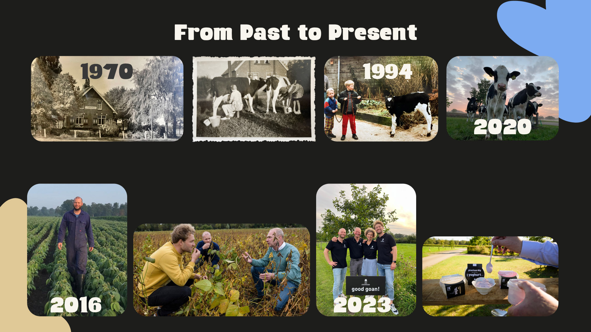
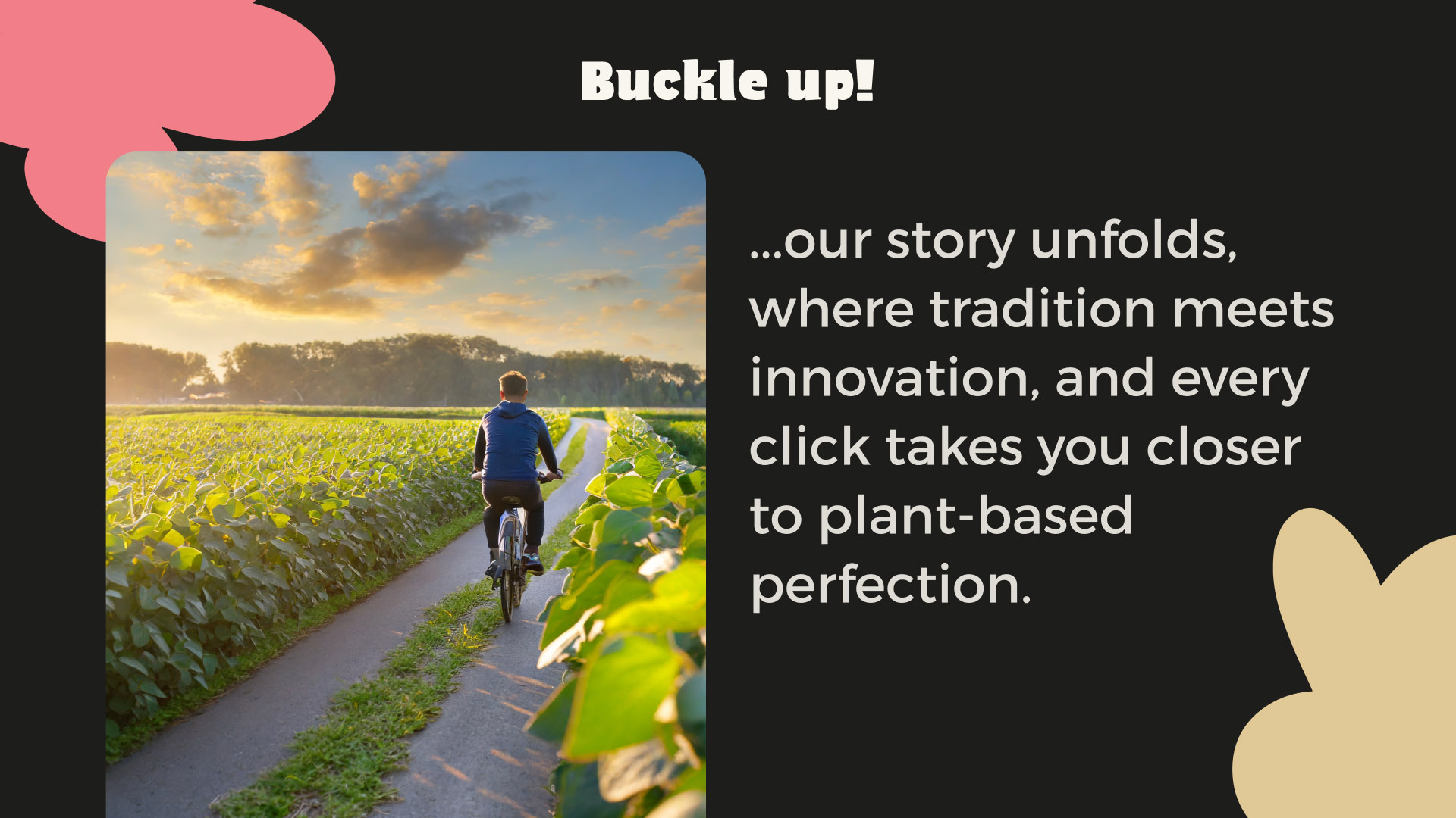
Once upon a time, nestled in the idyllic countryside, Bart and Tom, former dairy farmers, contemplated the future of farming life. In the heart of Amsterdam, they stumbled upon a burgeoning trend towards plant-based alternatives, sparking a seed of innovation. This is the genesis of De Nieuwe Melkboer, where tradition met transformation, and the journey towards sustainable, plant-based dairy began.
The business goal was to create a user-friendly website and webshop that effectively communicated their values and products to consumers. Simultaneously, the focus was on meeting the needs of health-conscious consumers seeking tasty and responsible dairy alternatives.
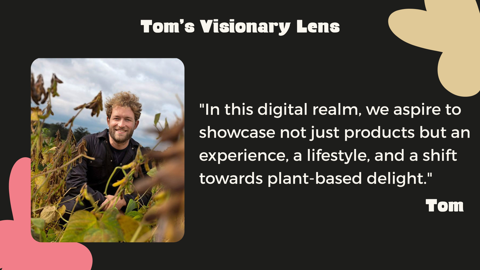
Our mission: to immerse visitors in the adventure of “De Nieuwe Melkboer,” the new milkman, by weaving a tale of transparency and purpose throughout the soybean supply chain. As we set out to design a user-friendly website and webshop, our aim was clear: to showcase the products of De Nieuwe Melkboer – their plant-based yogurts – while communicating their core values of health, sustainability, and compassion.
However, our path was not without challenges. From the complexities of telling the family’s rich history to the struggle of presenting a comprehensive yet captivating narrative on the website, we encountered hurdles that tested our creativity and problem-solving skills. Yet, armed with insights from stakeholder interviews and collaborative brainstorming sessions, we forged ahead, determined to create a digital experience that not only captivated but also educated and inspired.
Join us on this journey as we navigate the twists and turns of designing for De Nieuwe Melkboer, where each obstacle became an opportunity for innovation, and where the spirit of sustainability and storytelling converged to redefine the dairy industry landscape.
How do we understand the needs of our target audience?
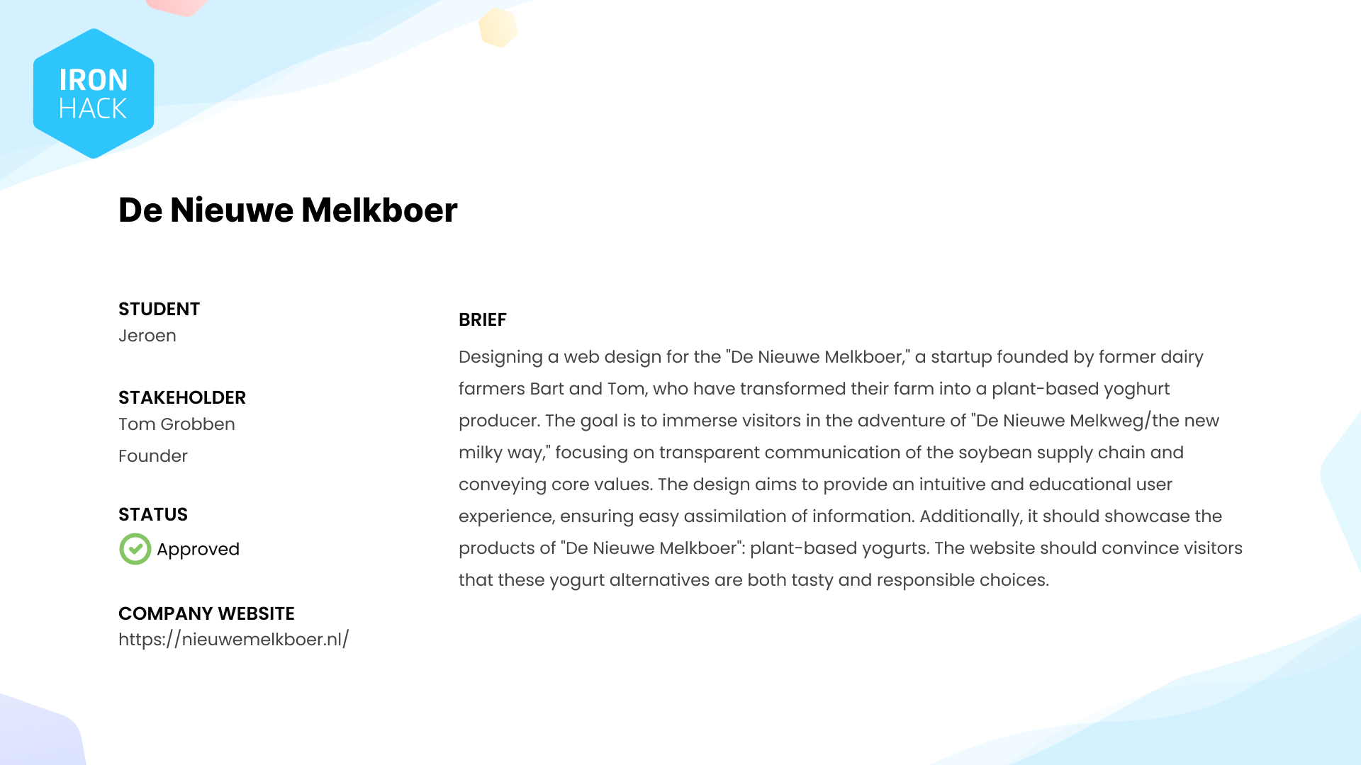
Brief
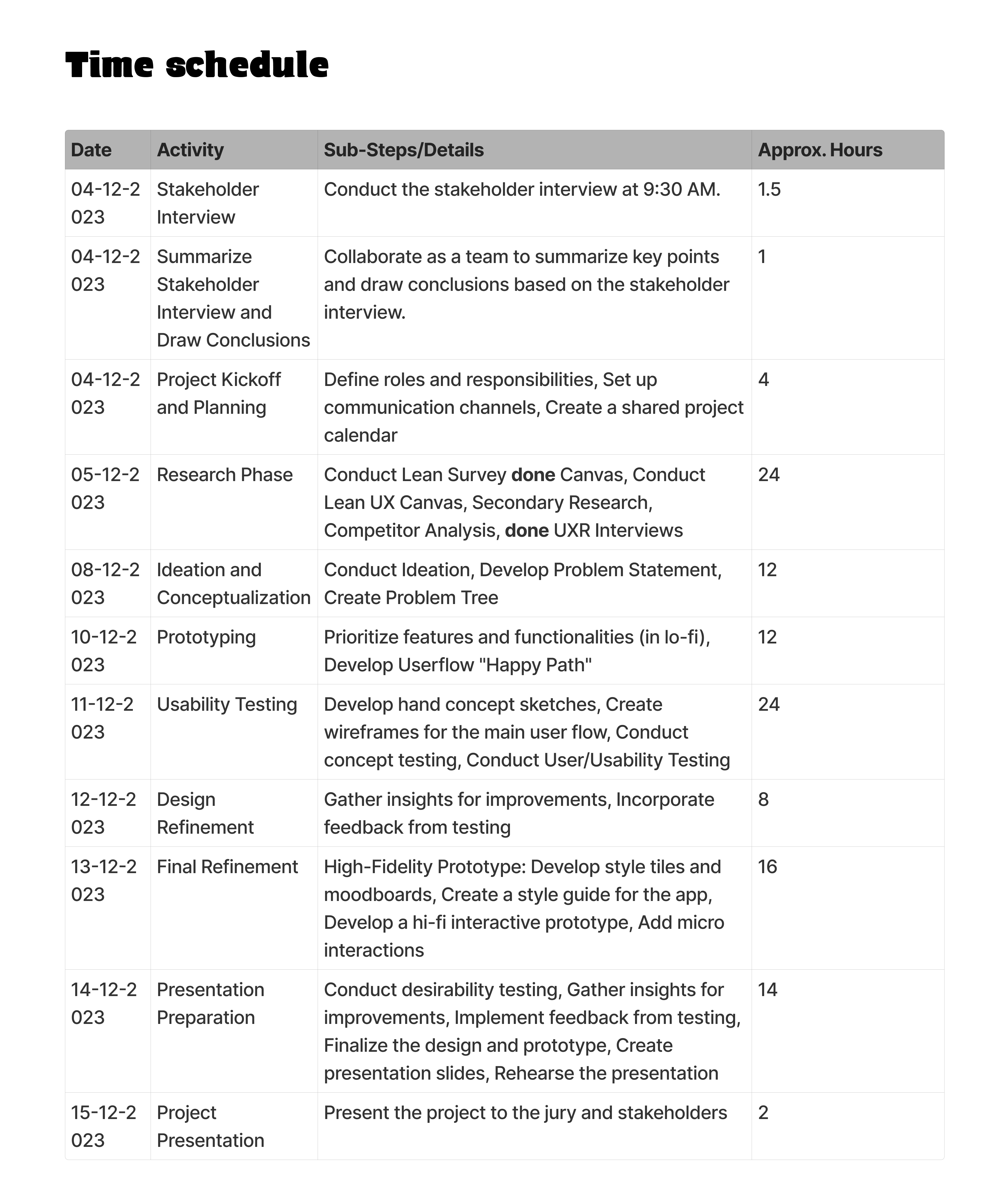
Time schedule UX sprint design project
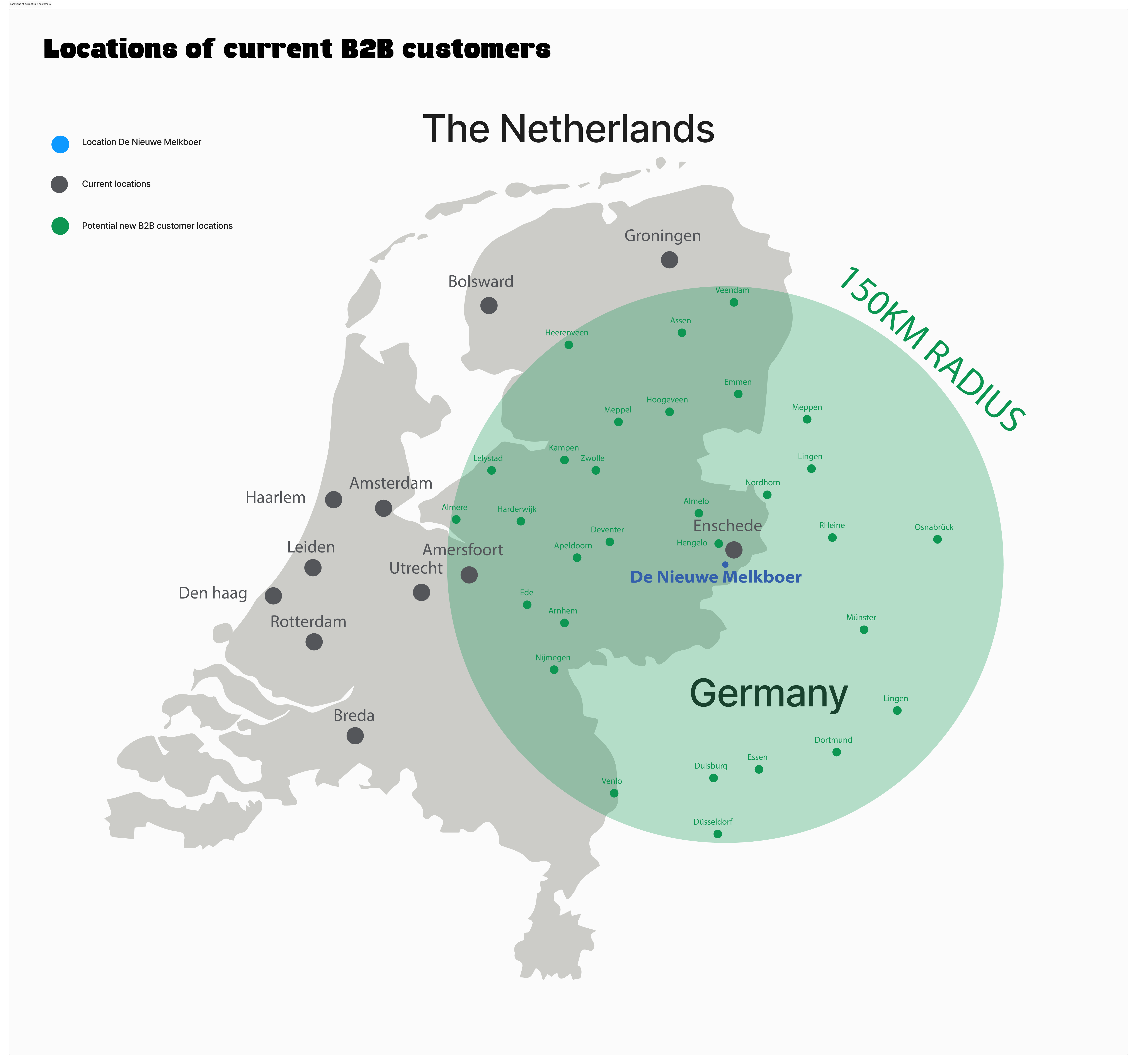
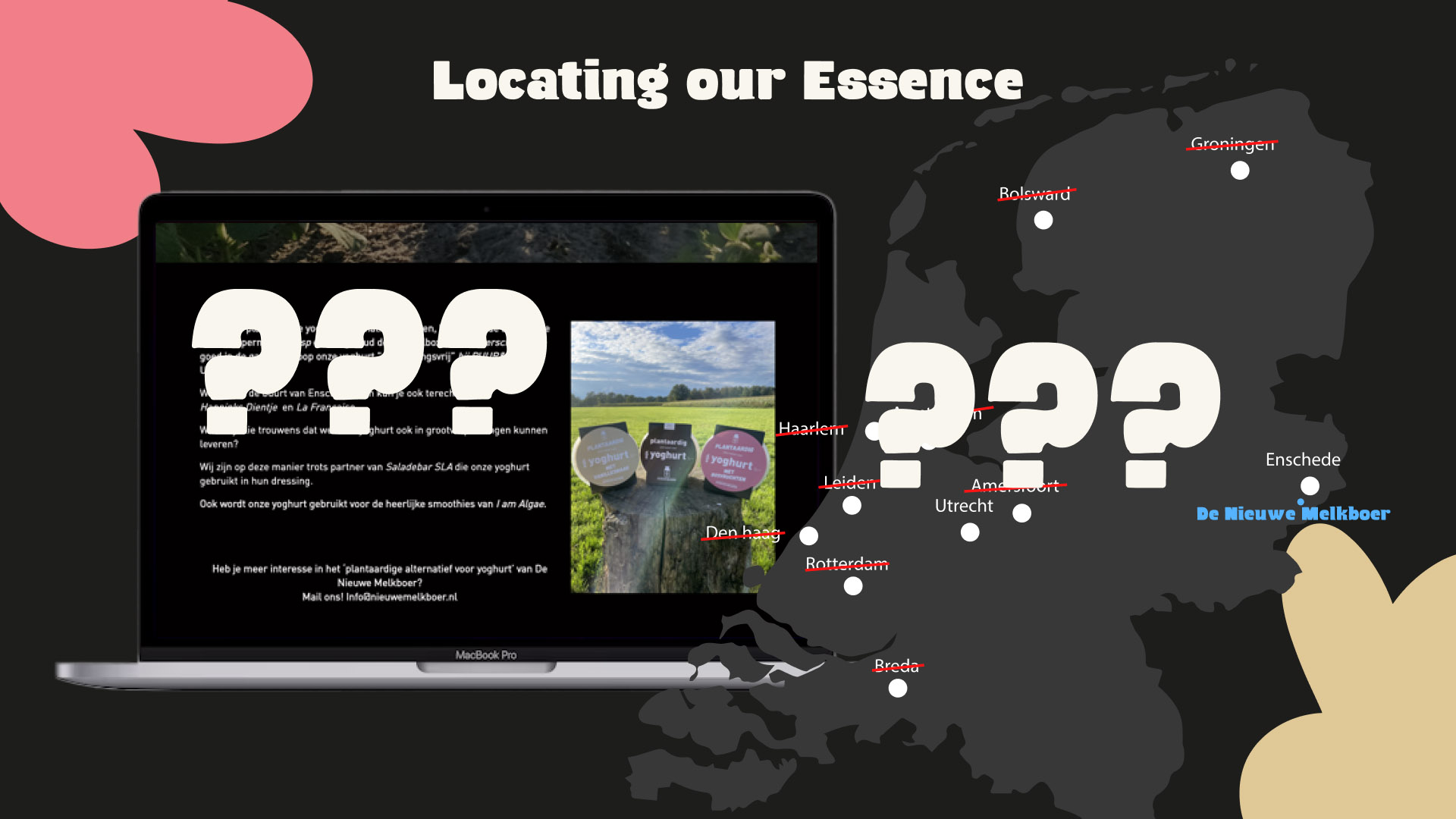
Locations of current B2B customers
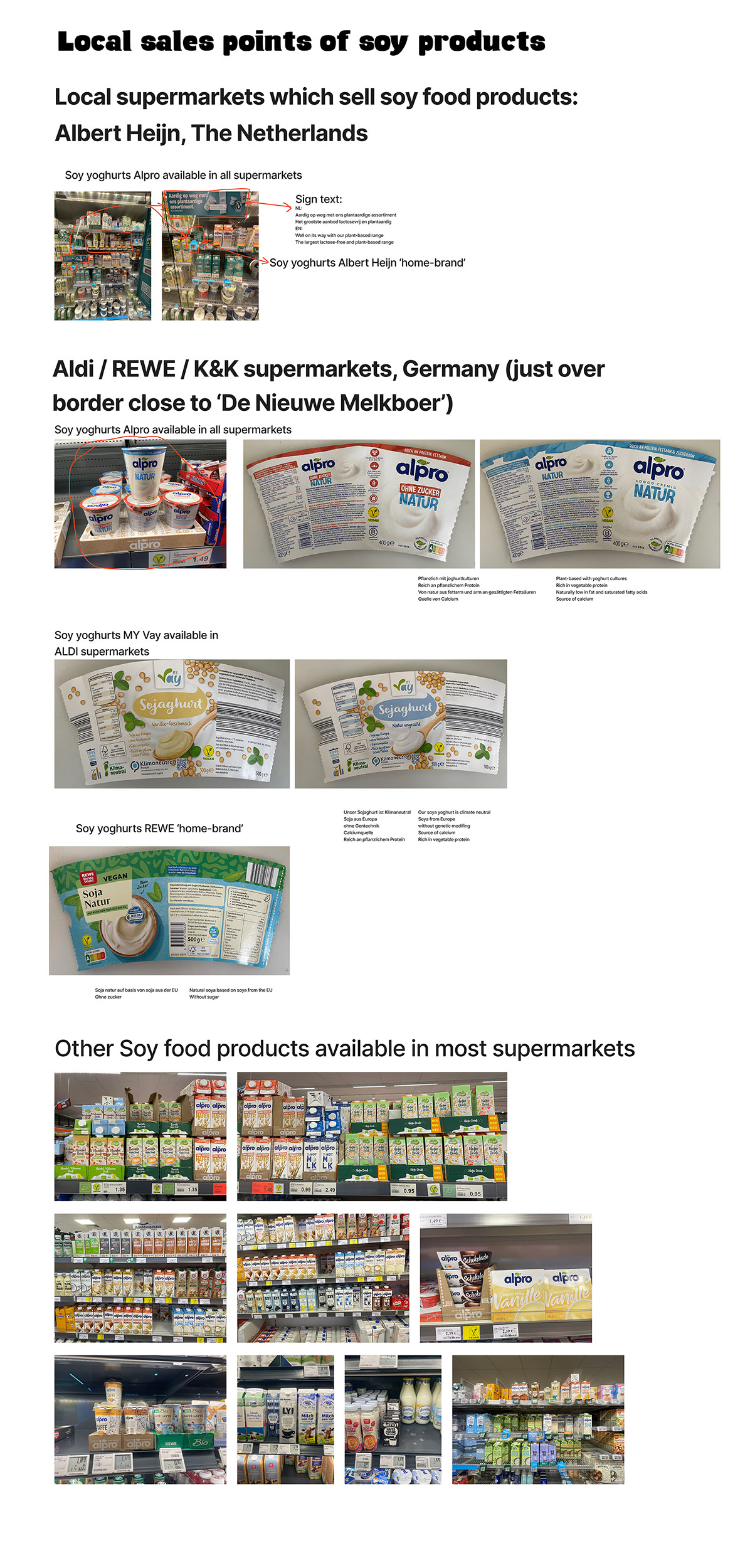
Local sales points of soy products
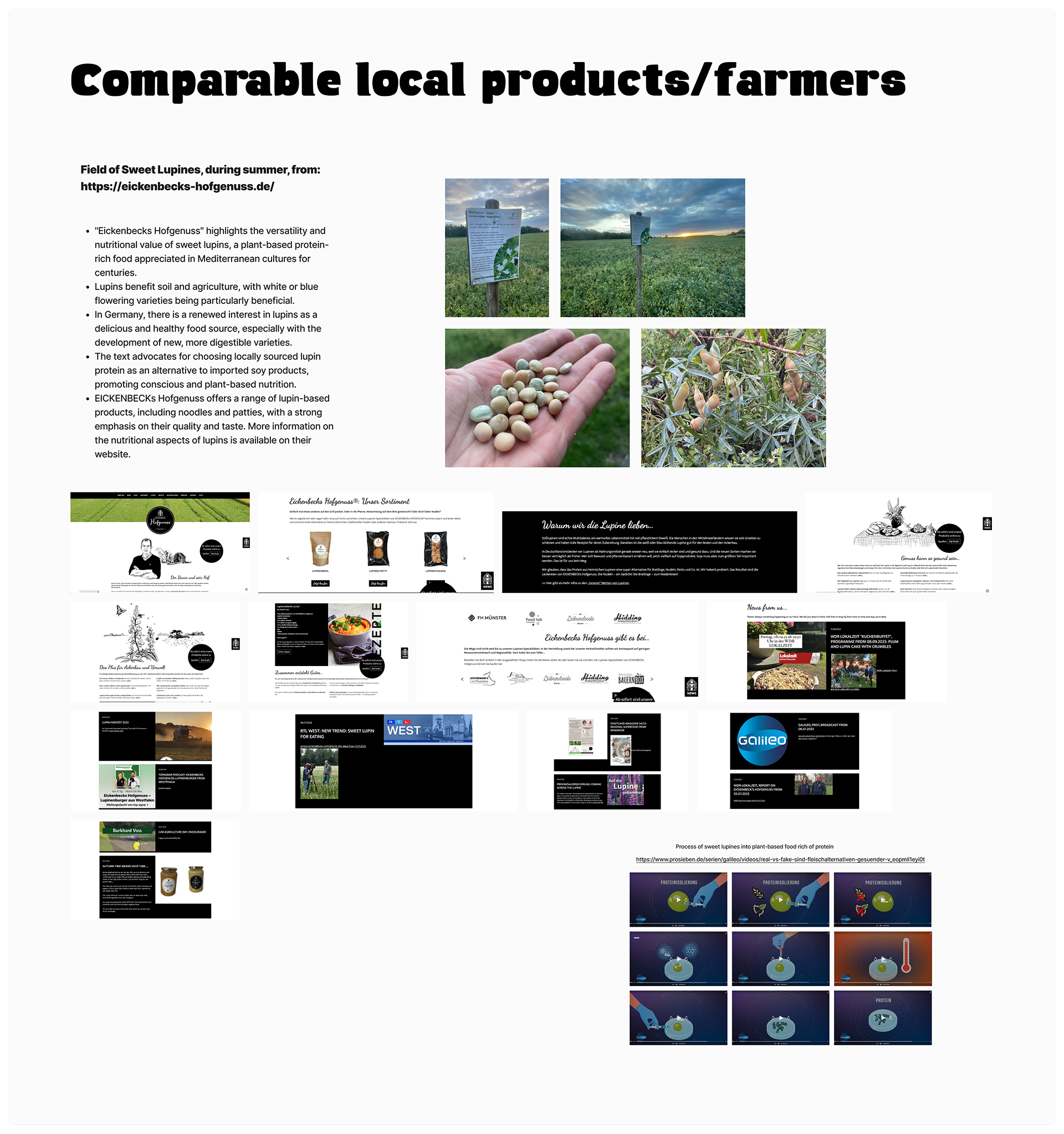
Comparable local products:farmers
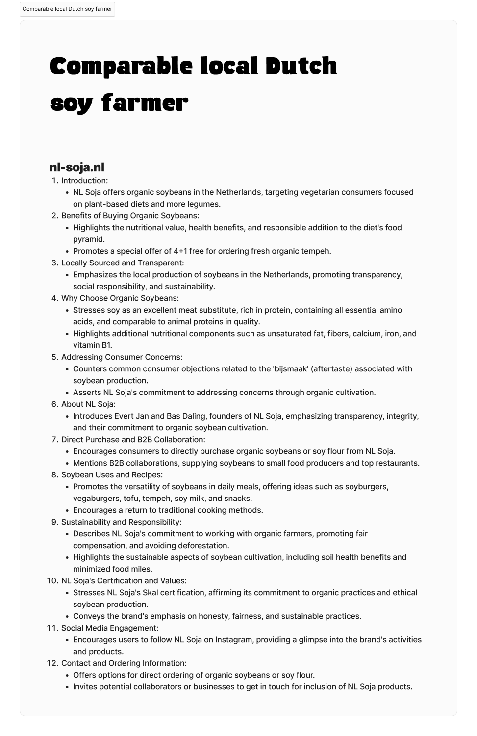
Comparable local Dutch soy farmer
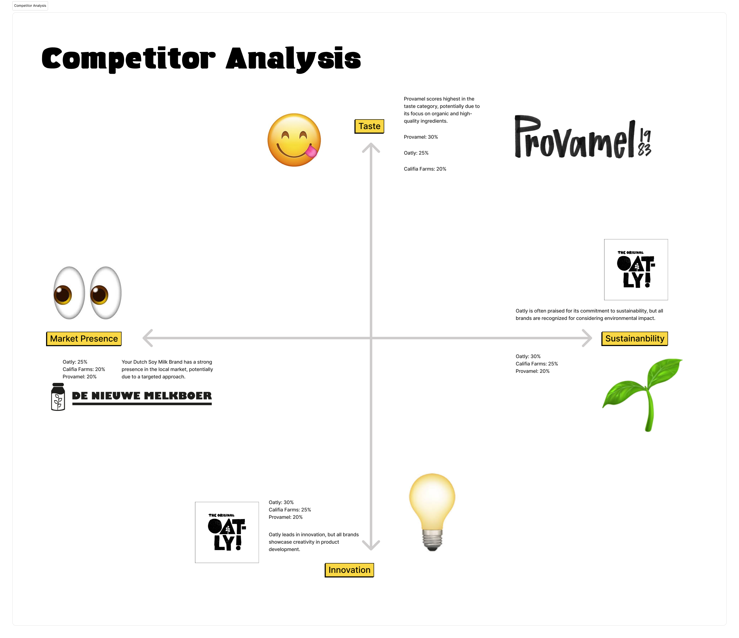
Competitor Analysis
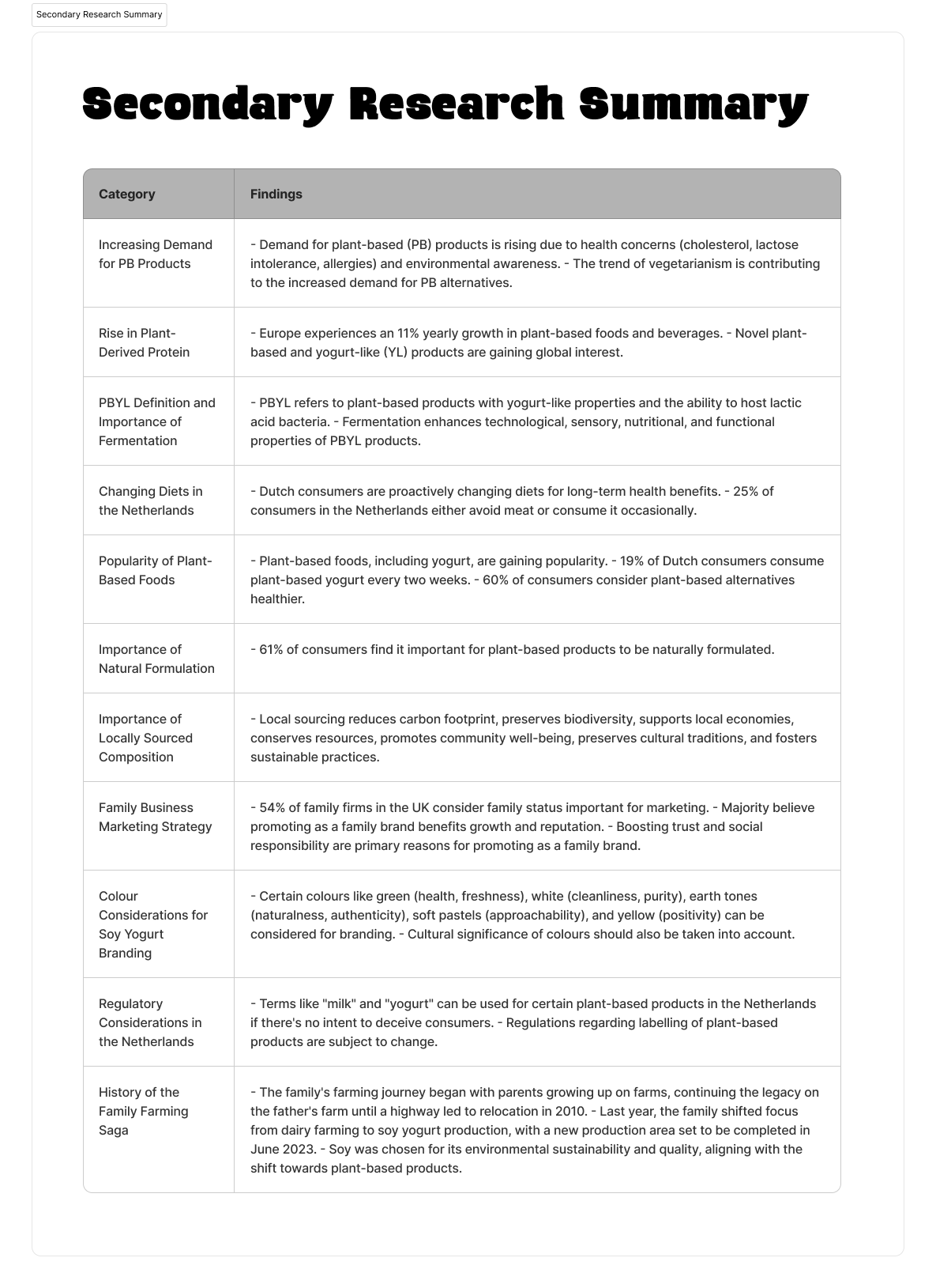
Secondary Research Summary
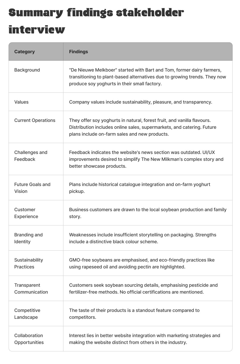
Summary findings stakeholder interview
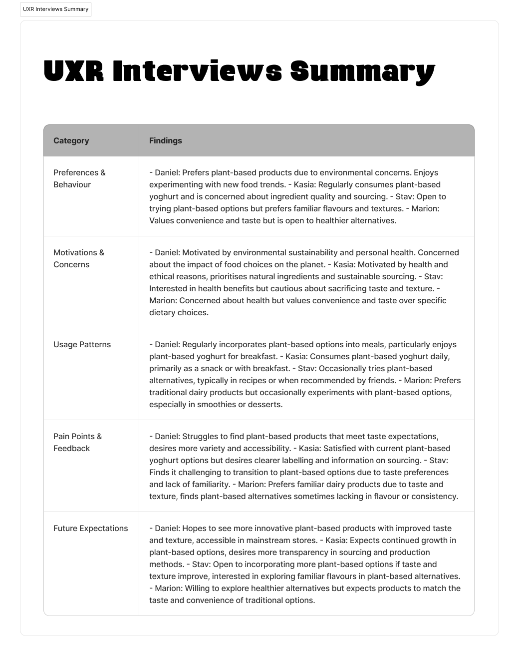
UXR Interviews Summary
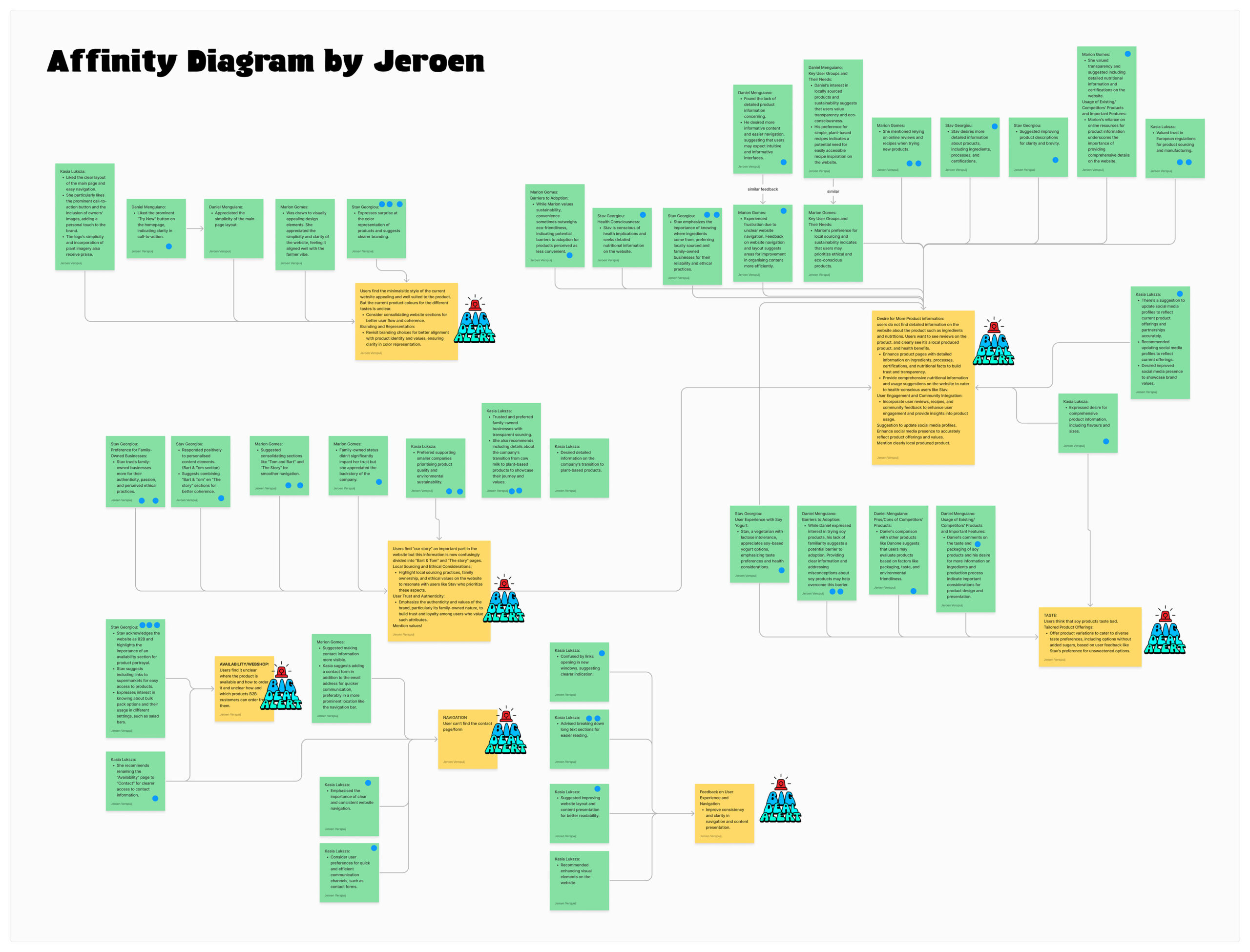
Affinity Diagram by Jeroen
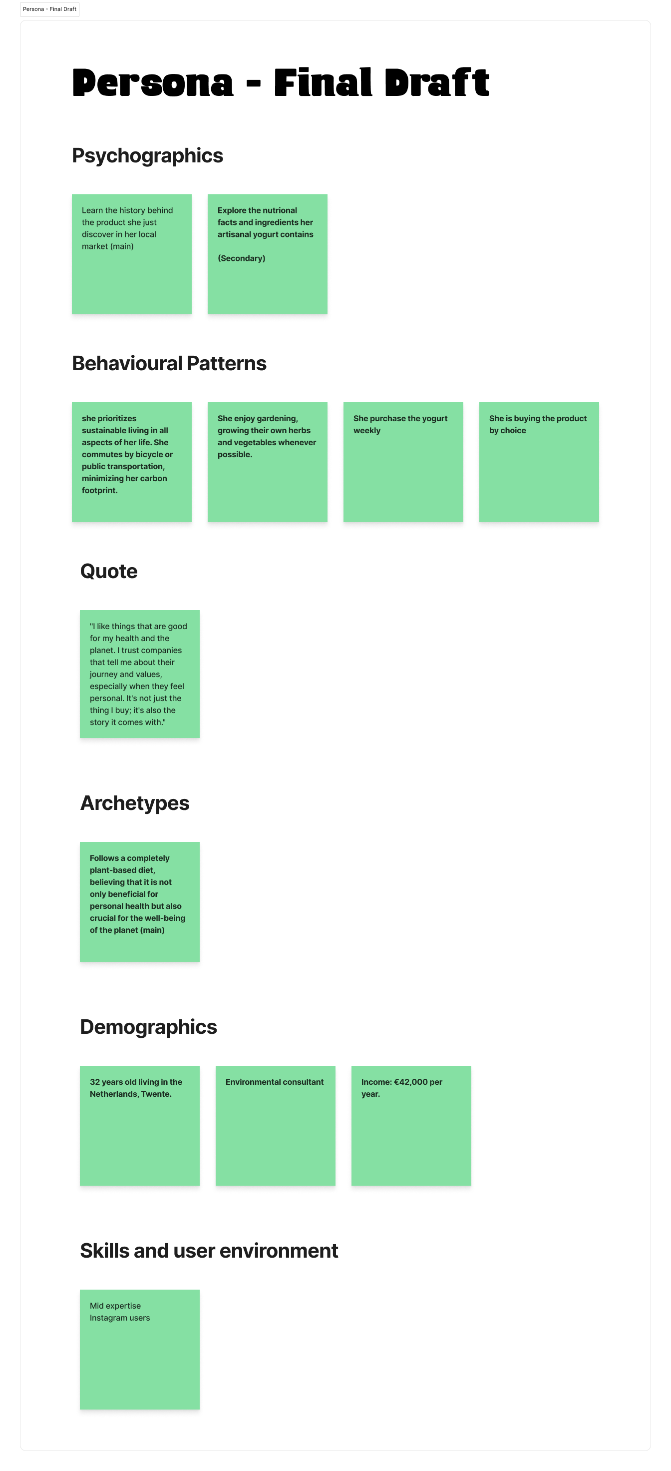
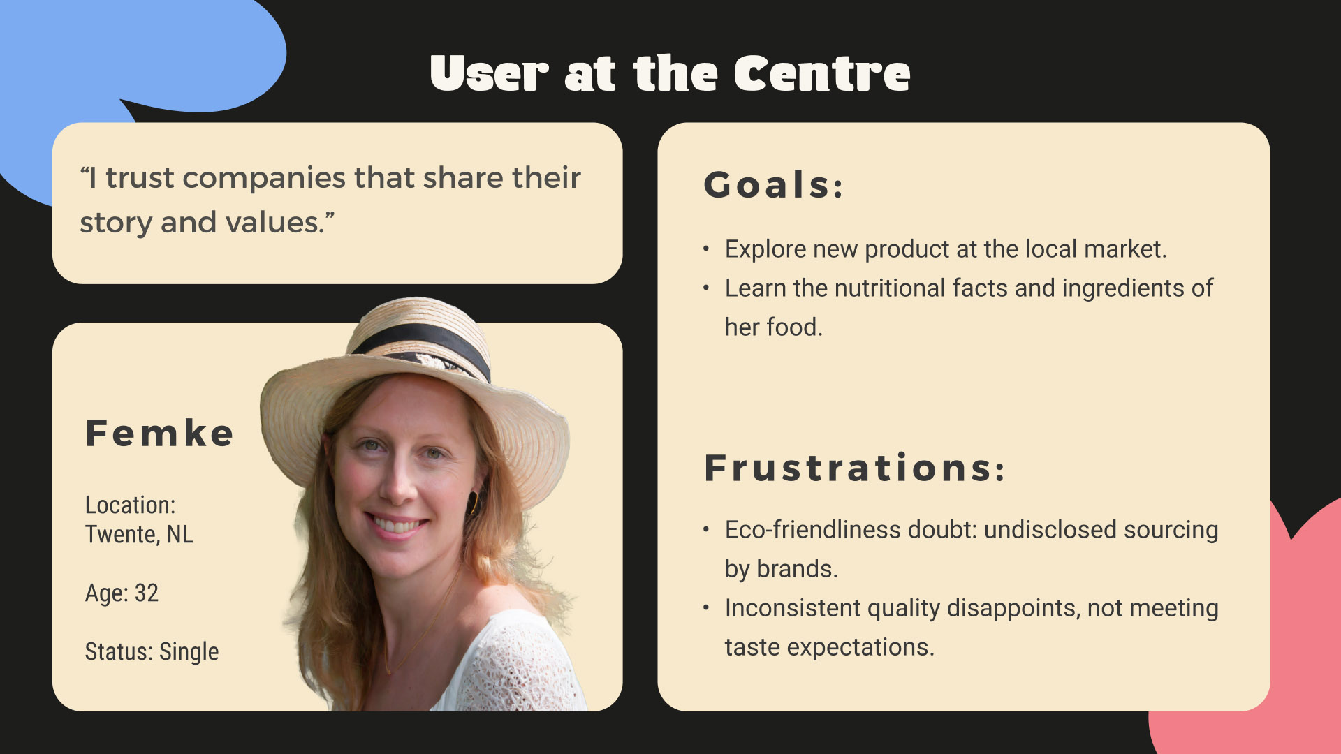
Persona – Final Draft
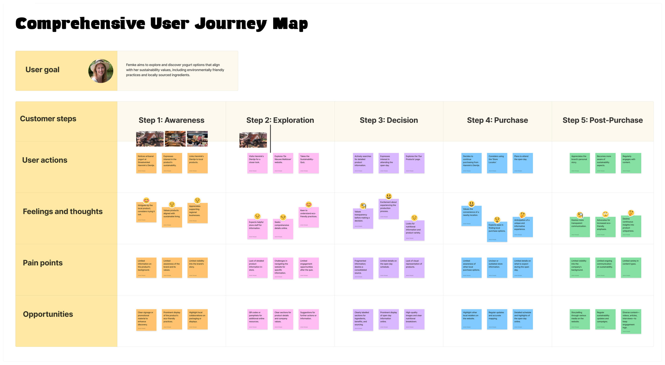
Comprehensive User Journey Map
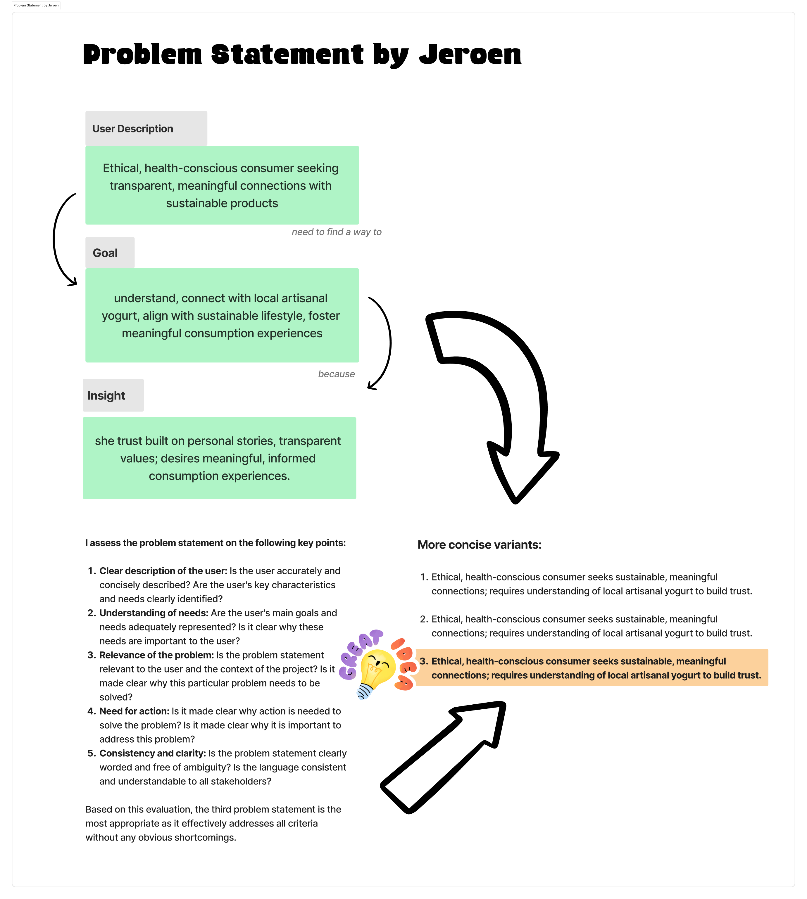
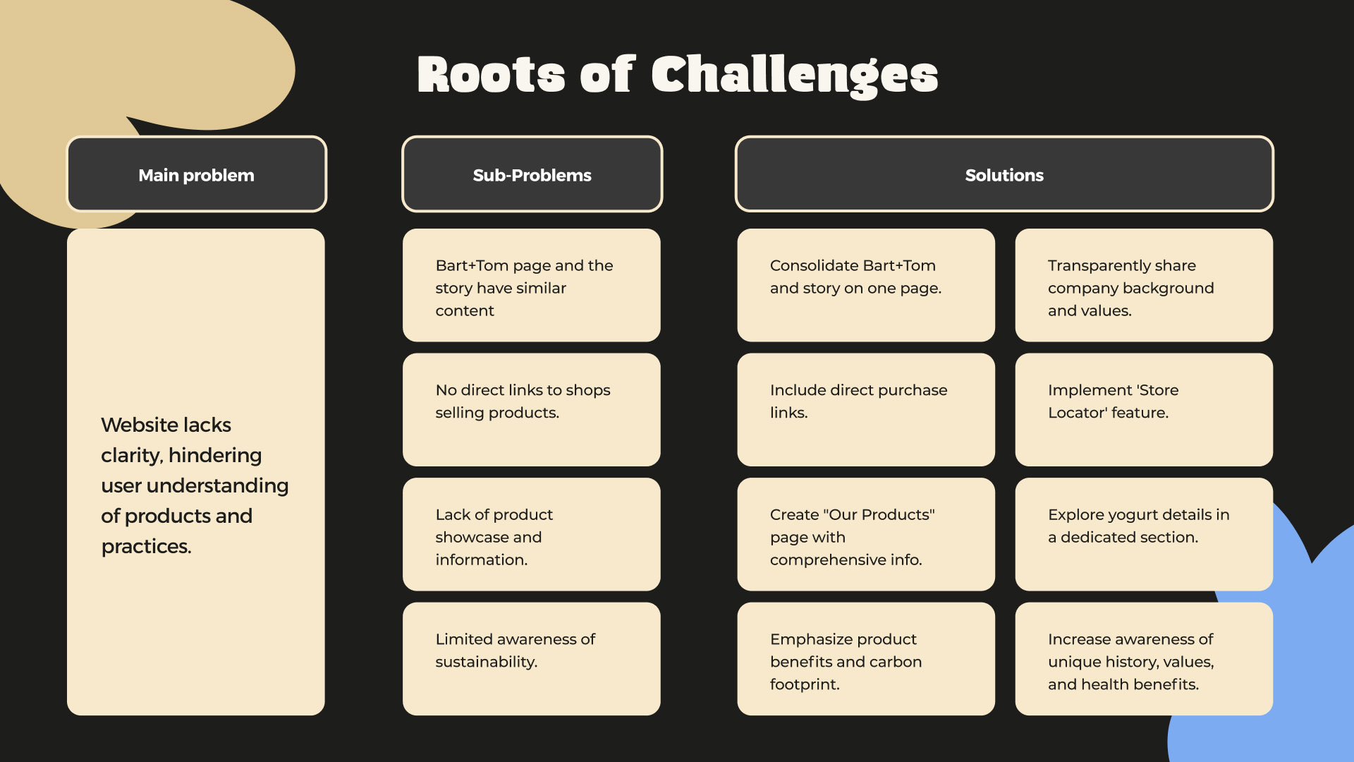
Problem Statement by Jeroen
Problem statement: Ethical, health-conscious consumer seeks sustainable, meaningful connections; requires understanding of local artisanal yogurt to build trust.
Research and analysis
Our discovery journey began with in-depth market research, focusing on understanding the needs and expectations of our target audience. This research included interviews, surveys and user tests, which helped us identify customer segments and understand their specific needs.
During our research, it became clear that there was a growing demand for plant-based alternatives, driven by health-conscious consumers and a growing awareness of environmental issues. We also discovered that transparency and sustainability were crucial factors for our target audience when making their choices.
Through journey maps, we mapped different customer segments’ interactions with our product, giving us in-depth insights into their experiences and challenges. This visual representation allowed us to make targeted design decisions and ensure that our product met our users’ needs and expectations.
Armed with these insights, we developed a strategy to deliver a revolutionary plant-based dairy experience that not only met, but exceeded, our target audience’s expectations.
How did I find innovative solutions to the identified problems during the design and development process?
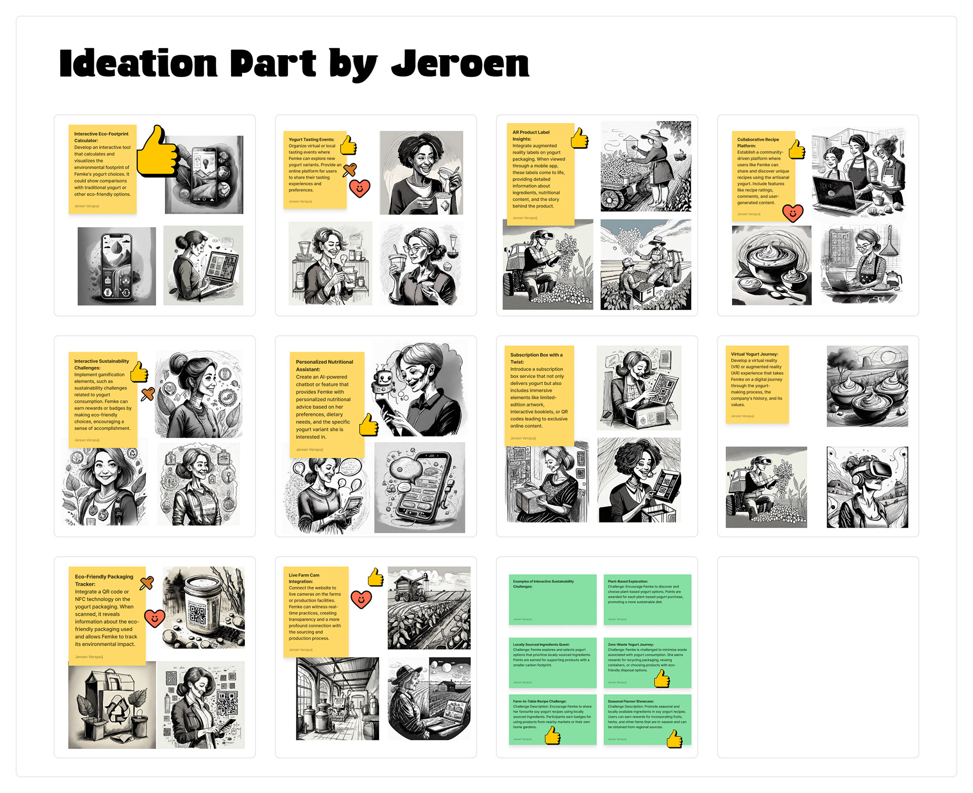
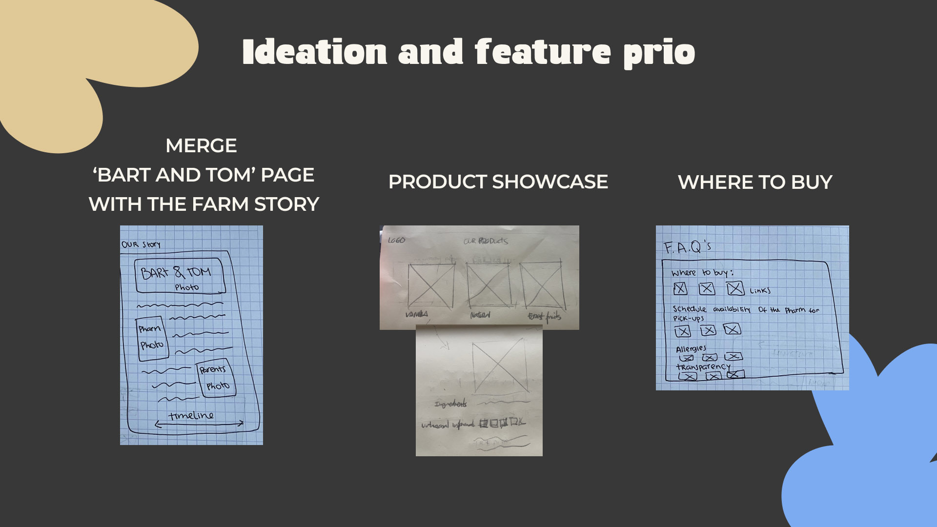
Ideation Part by Jeroen
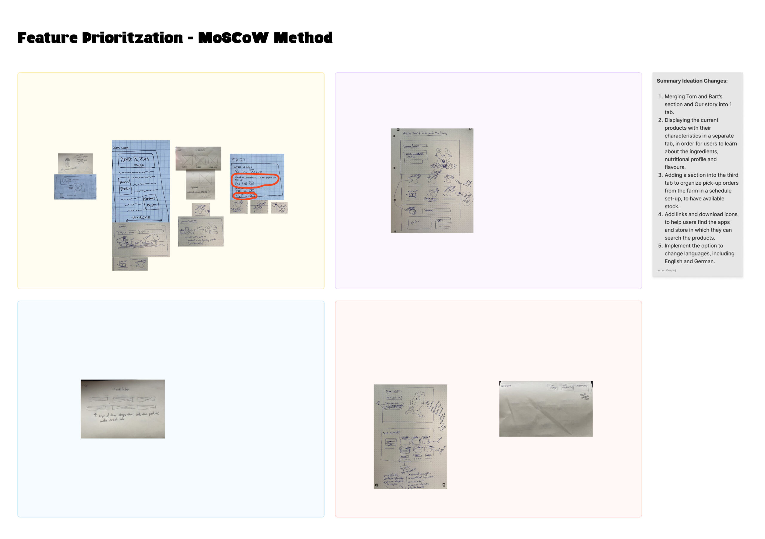
Feature Prioritization
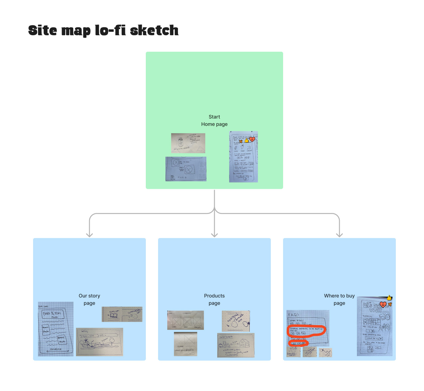
Site map Lo-fi sketch
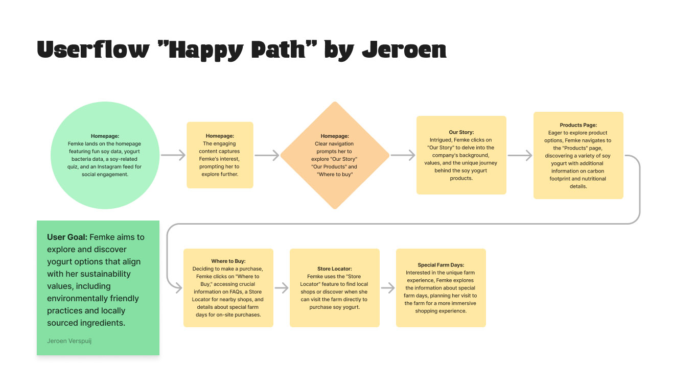
Userflow _Happy Path_ by Jeroen
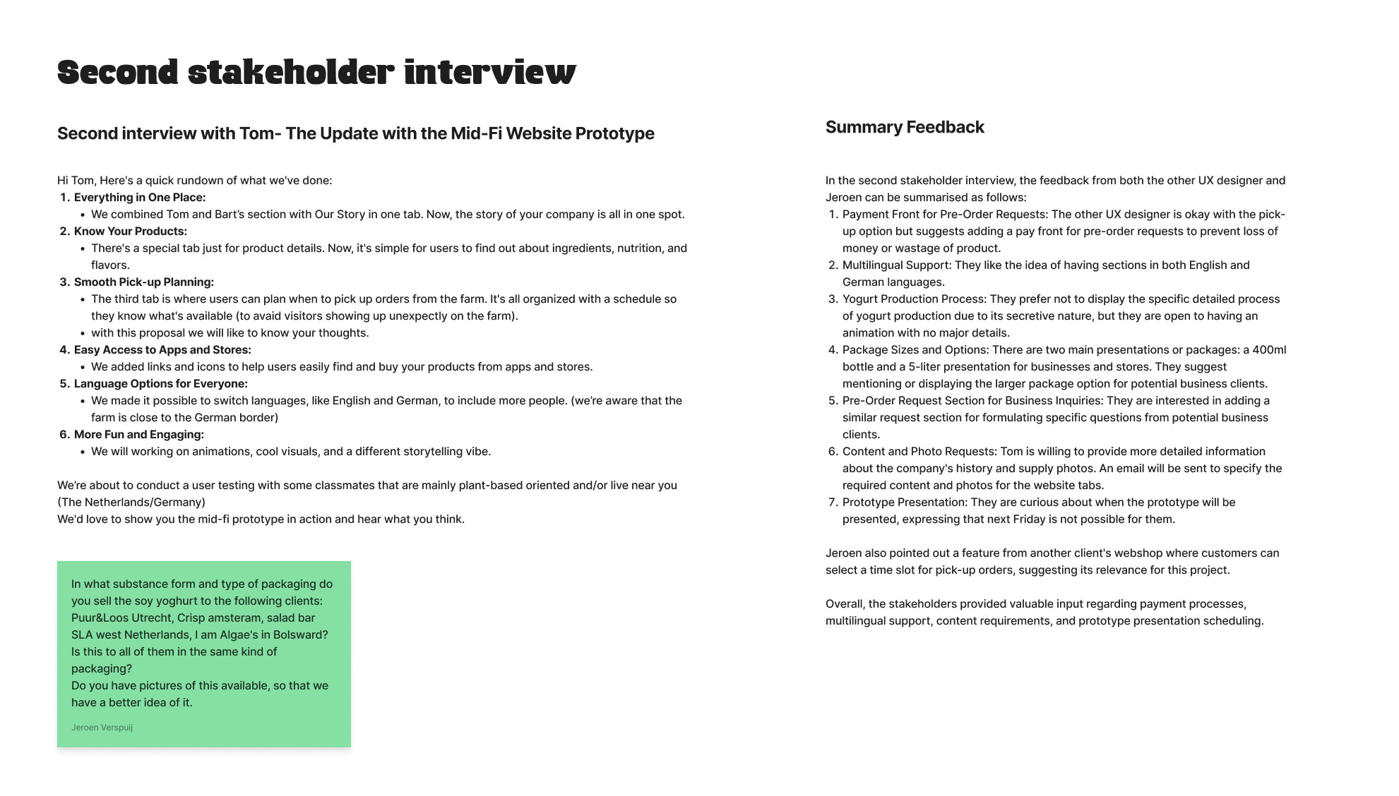
Second interview with Tom- The Update with the Mid-Fi Website Prototype
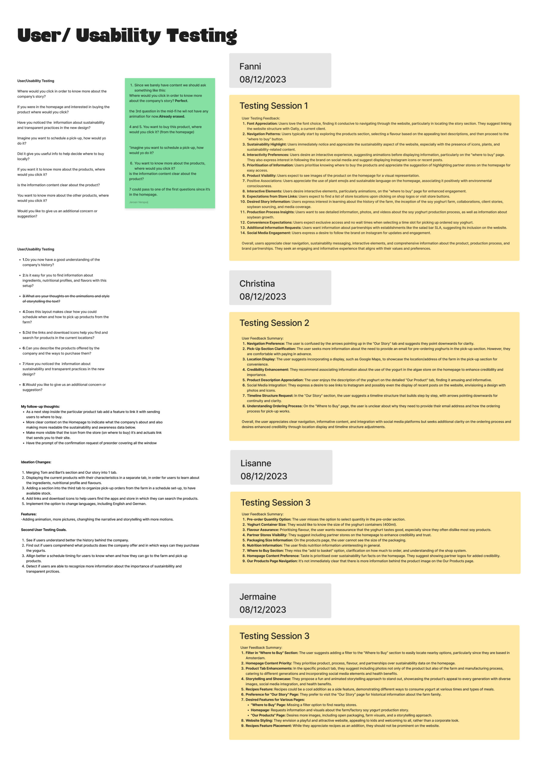
Usability_User_Testing
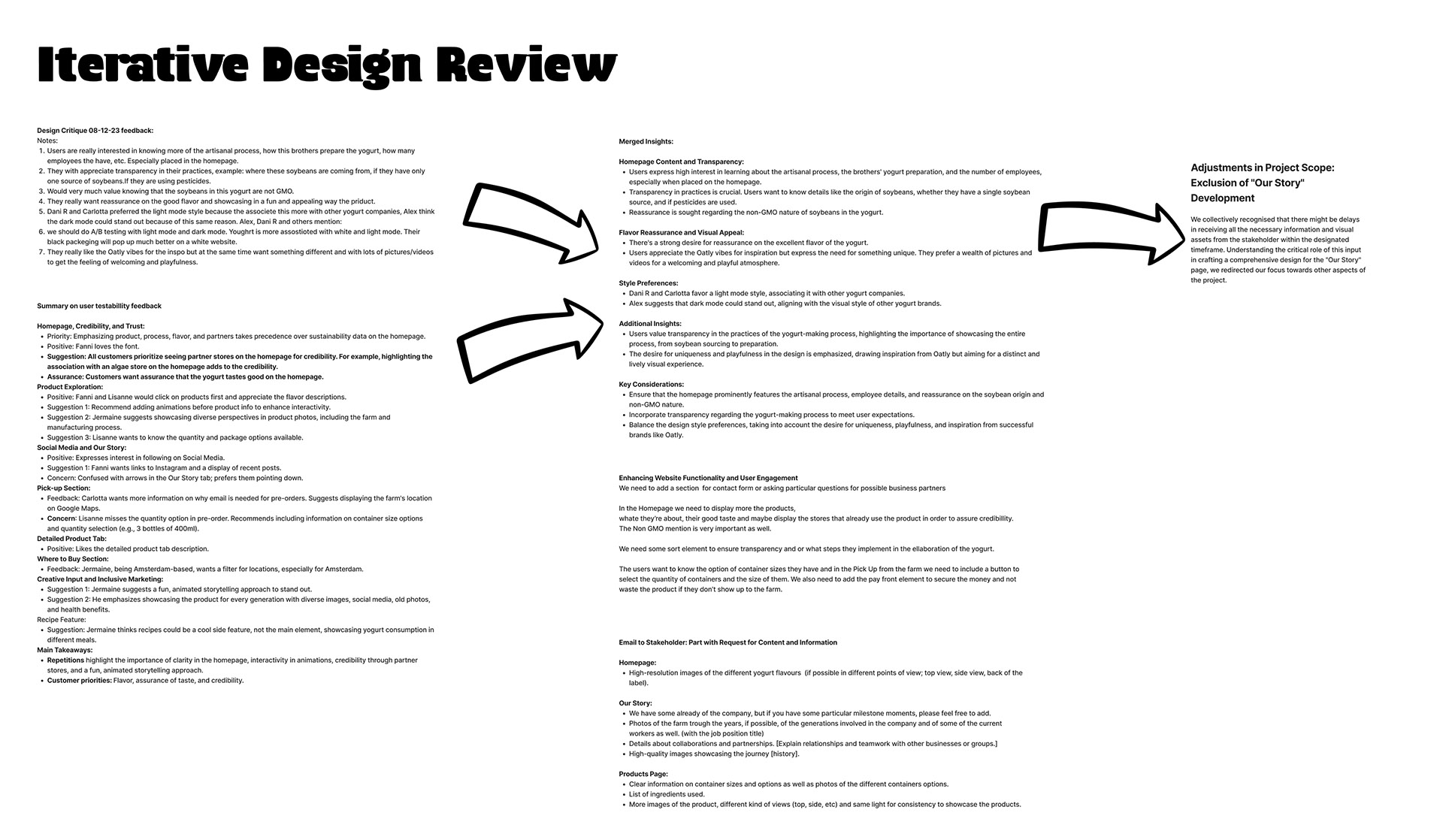
Iterative Design Review
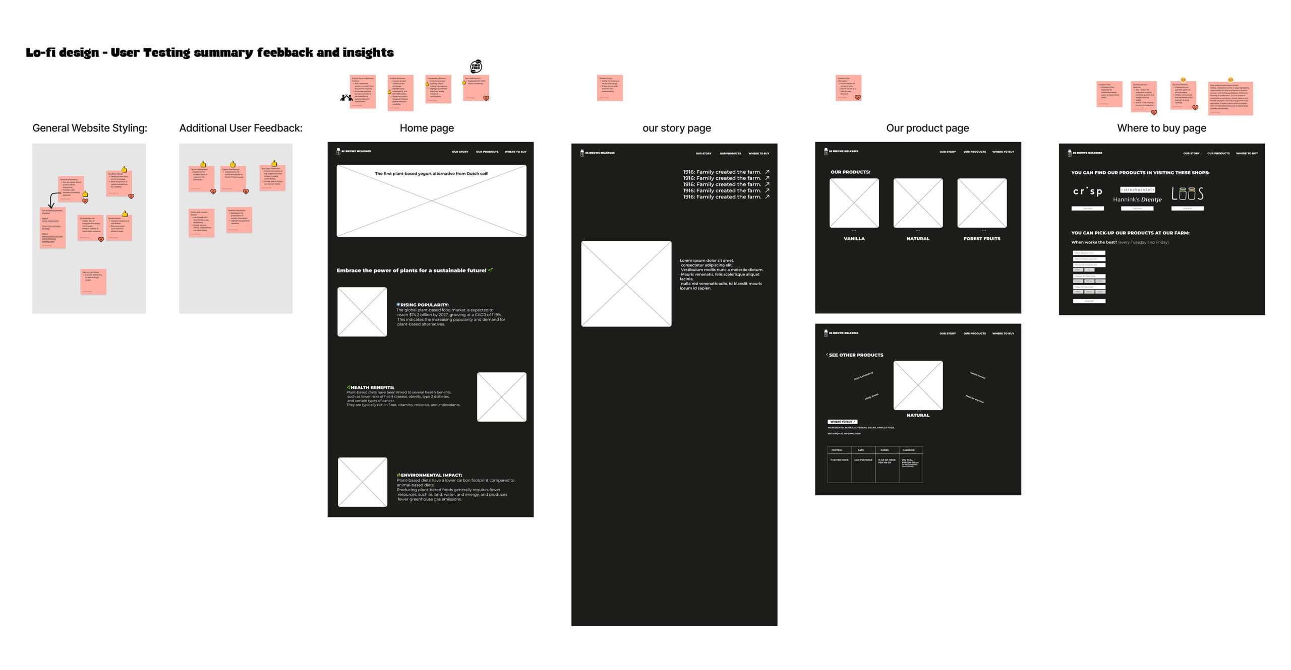
Lo-fi design – User Testing summary feebback and insights
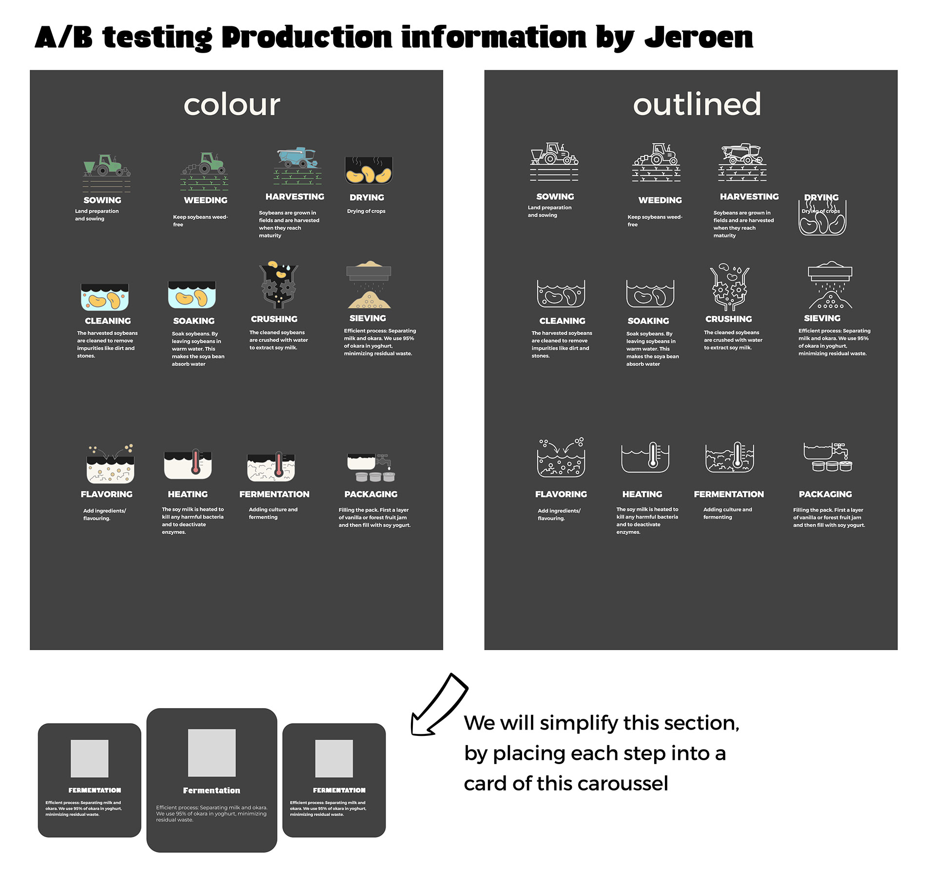
A_B testing Production information by Jeroen

Design and Development
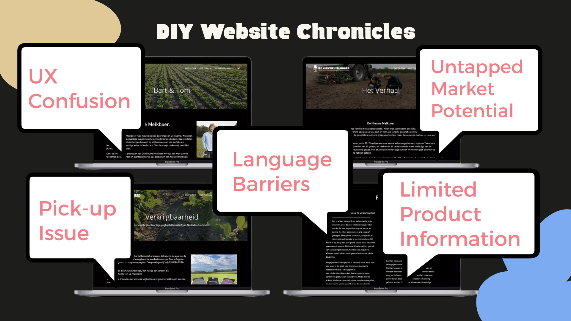
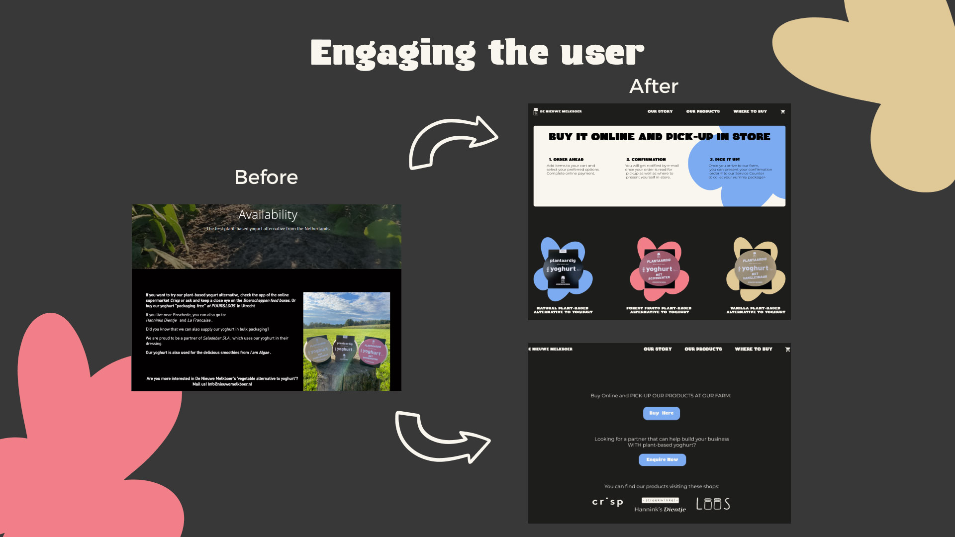
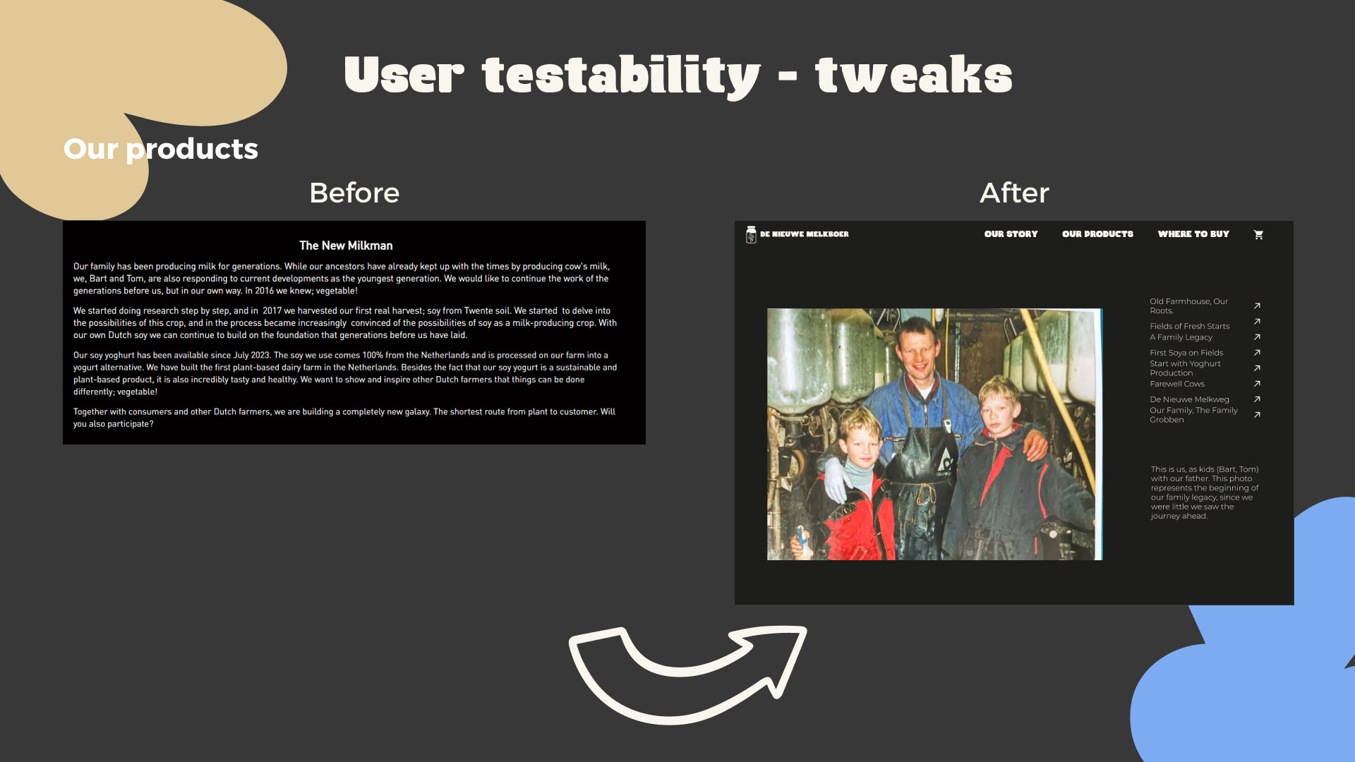
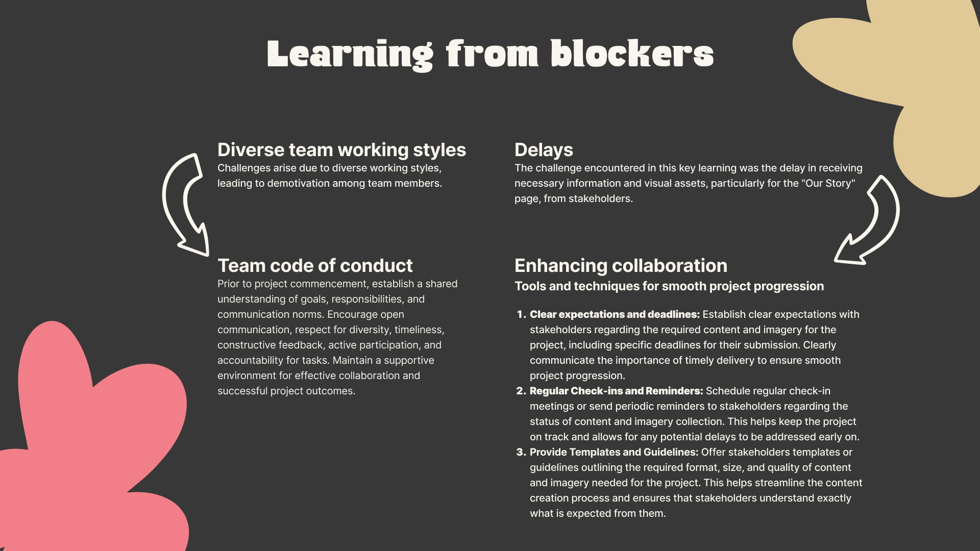
During the design and development process, we faced several challenges that called for creative solutions. Firstly, we identified that the story of The New Milkman was complex and that users struggled to fully understand it. Tom Grobben, co-founder of The New Milkman, remarked: “Our story is our greatest asset, but we need to communicate it better.” This feedback inspired us to simplify the design and focus on telling The New Milkman’s story through clear and engaging content.
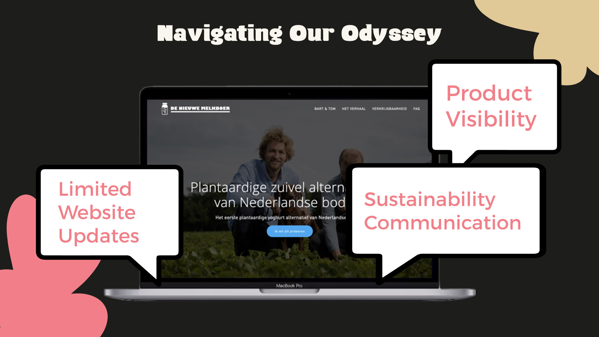
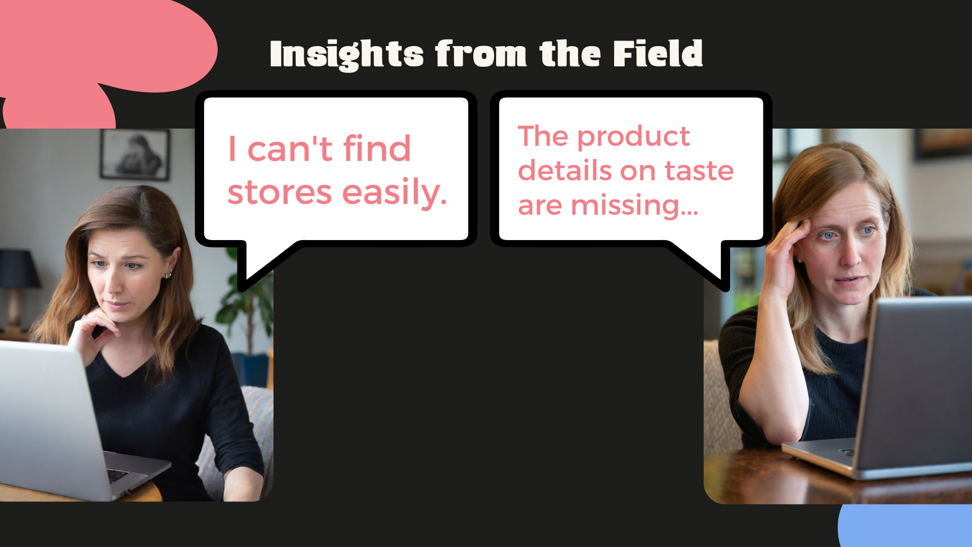
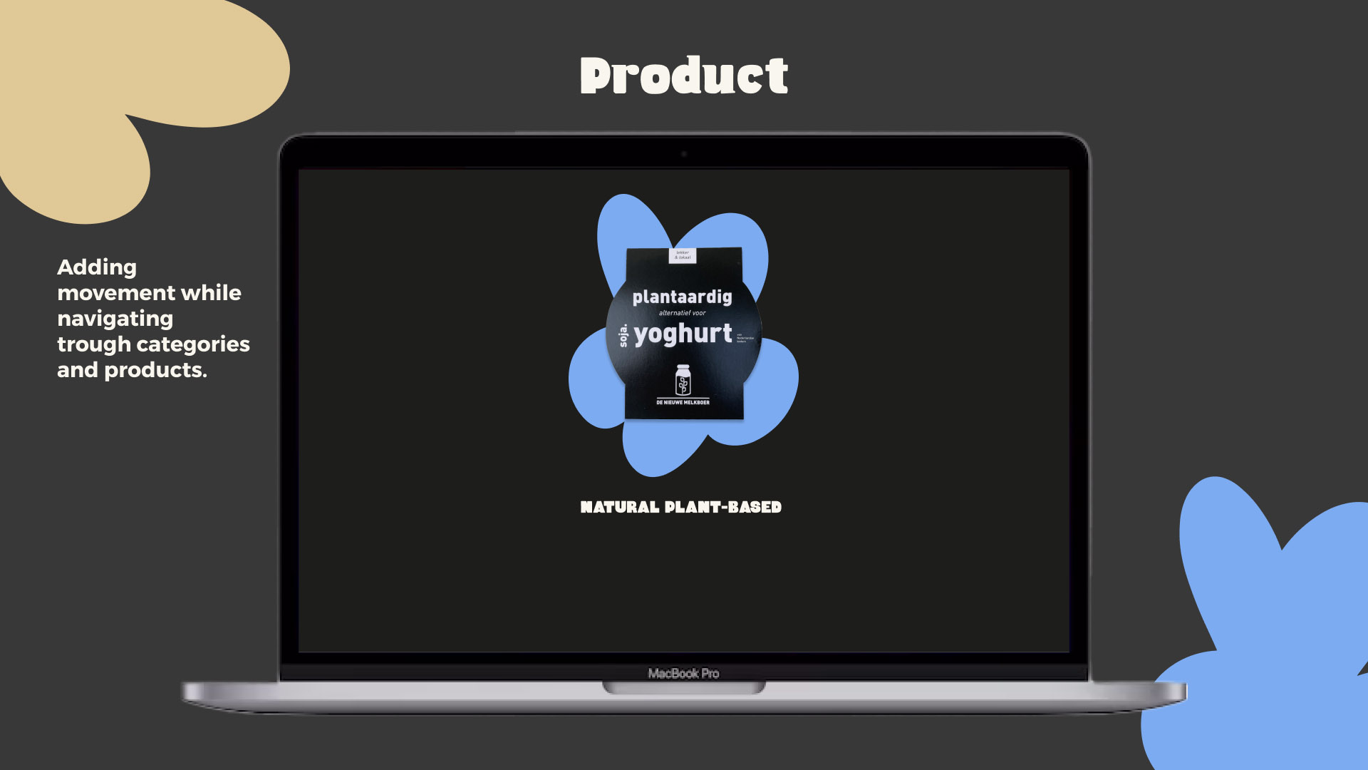
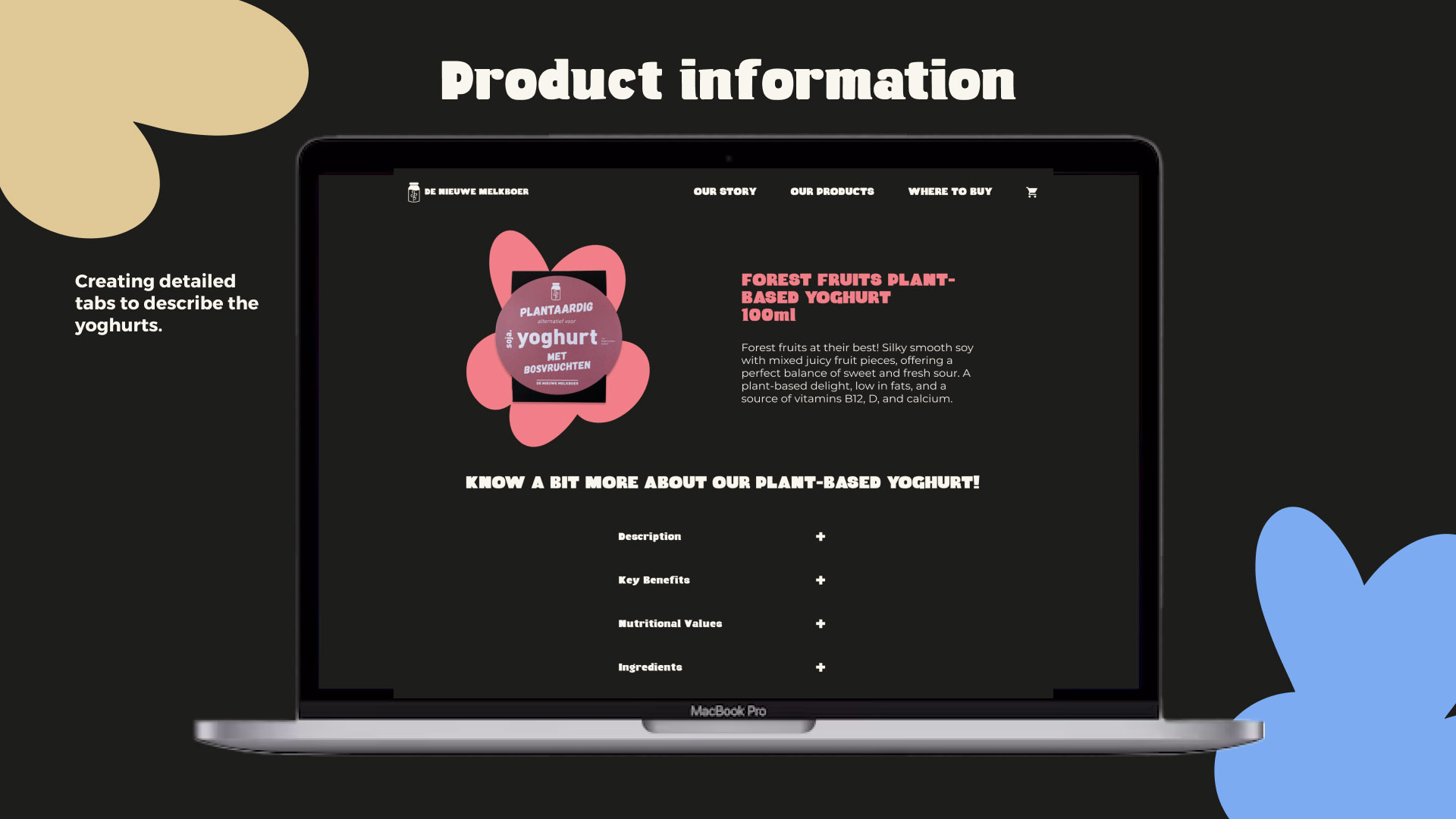
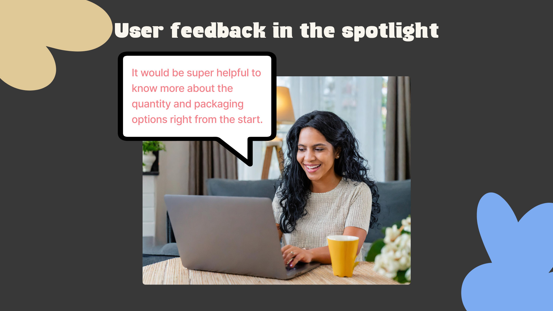
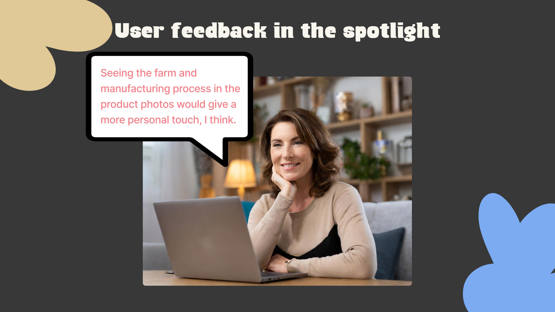
Another challenge was the lack of focus on the product in the website and webshop. User testing showed that users struggled to find and understand The New Milkman’s products. One user remarked: “I would like to see more information about the different types of yoghurt and how they are produced.” This feedback motivated us to improve the product presentation and display the information about the different types of yoghurt more clearly.
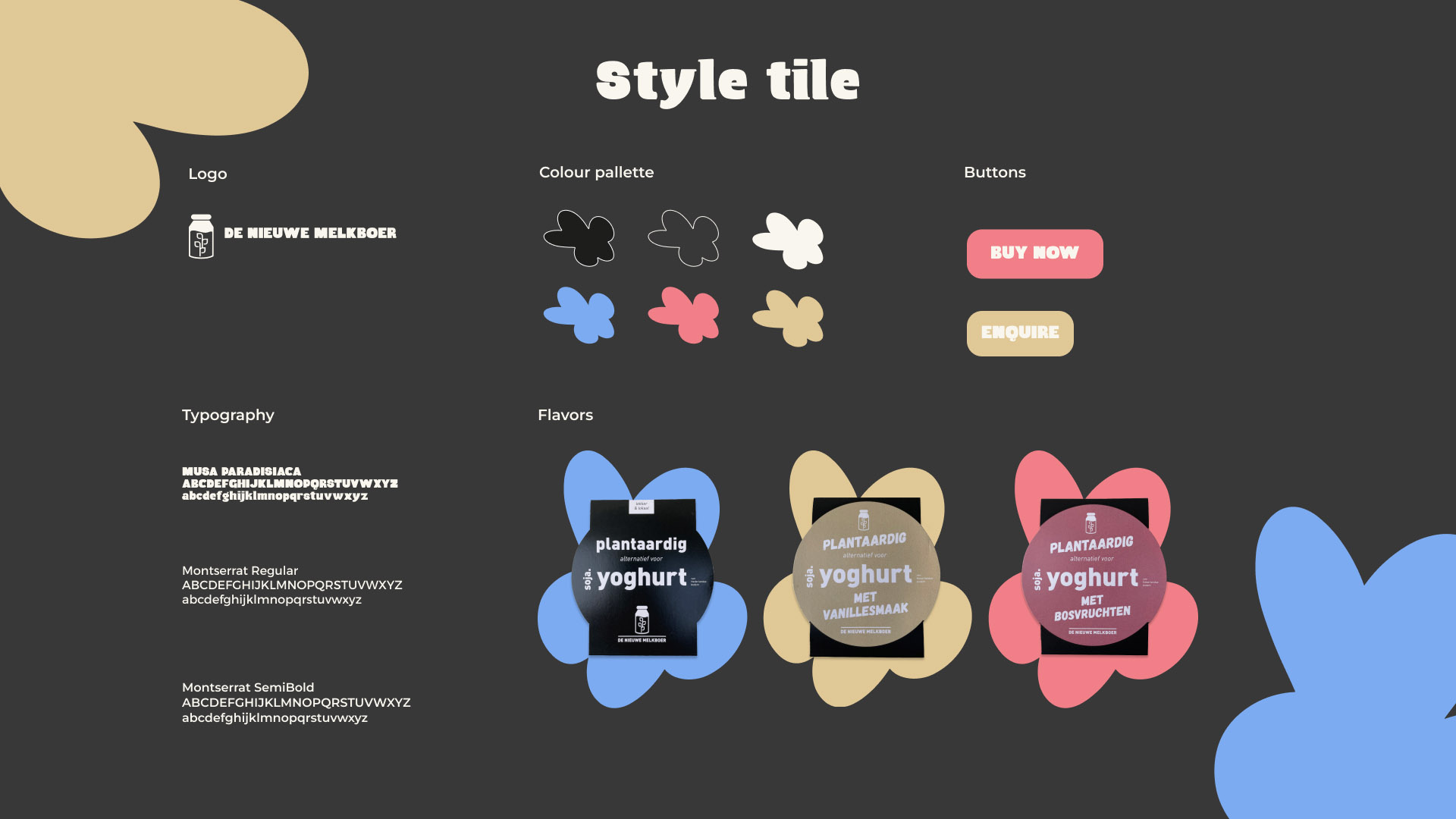
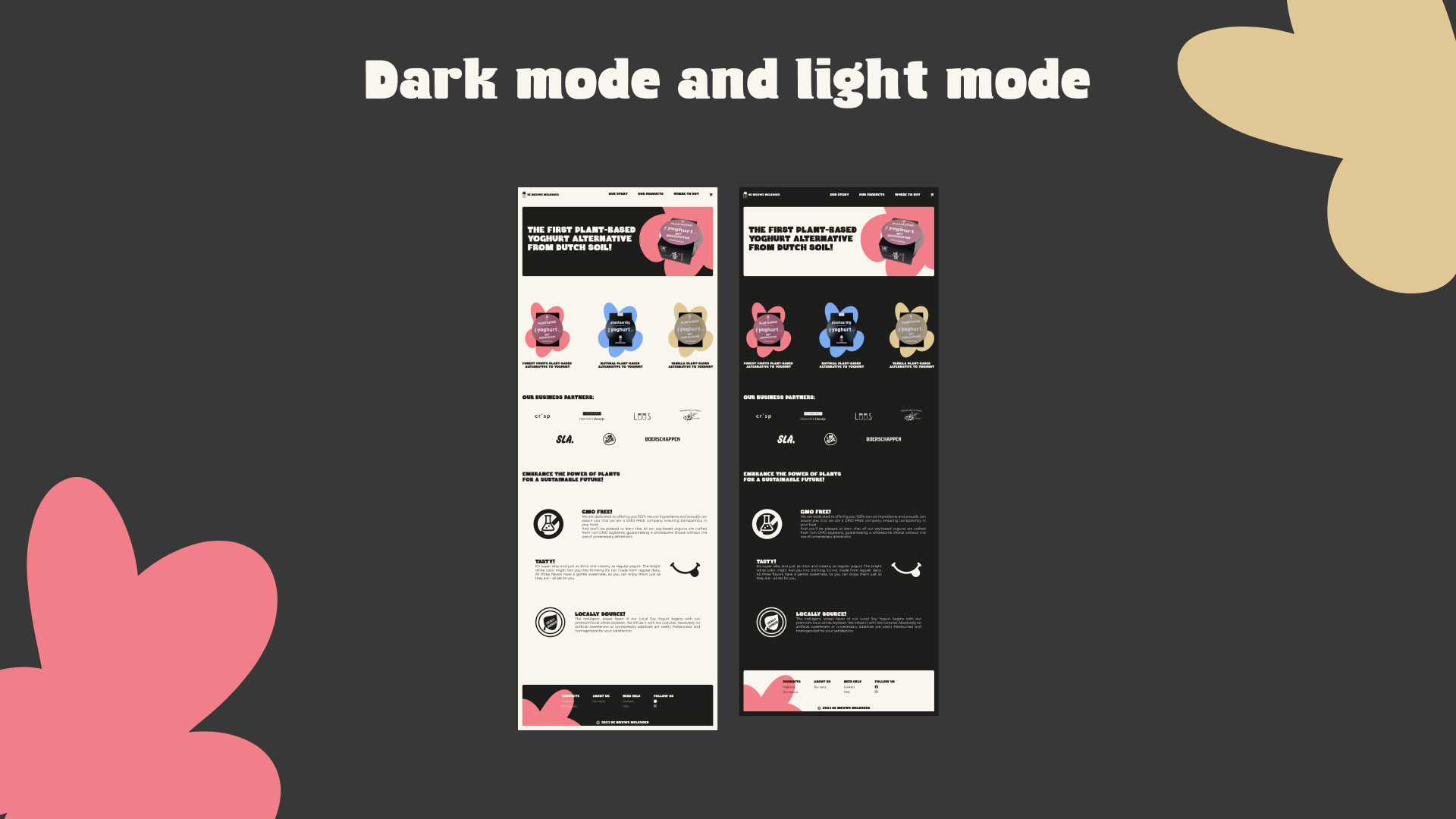
We also discovered that the design of the website and webshop was not sufficiently distinctive from competitors. “We want our website to be different from other websites,” Tom remarked during a feedback session. To meet this requirement, we added unique design elements that differentiate The New Milkman’s brand and provide a memorable user experience.
By tackling these challenges and coming up with creative solutions, we managed to develop a website and webshop that not only enhance the user experience, but also support De Nieuwe Melkboer’s business objectives.
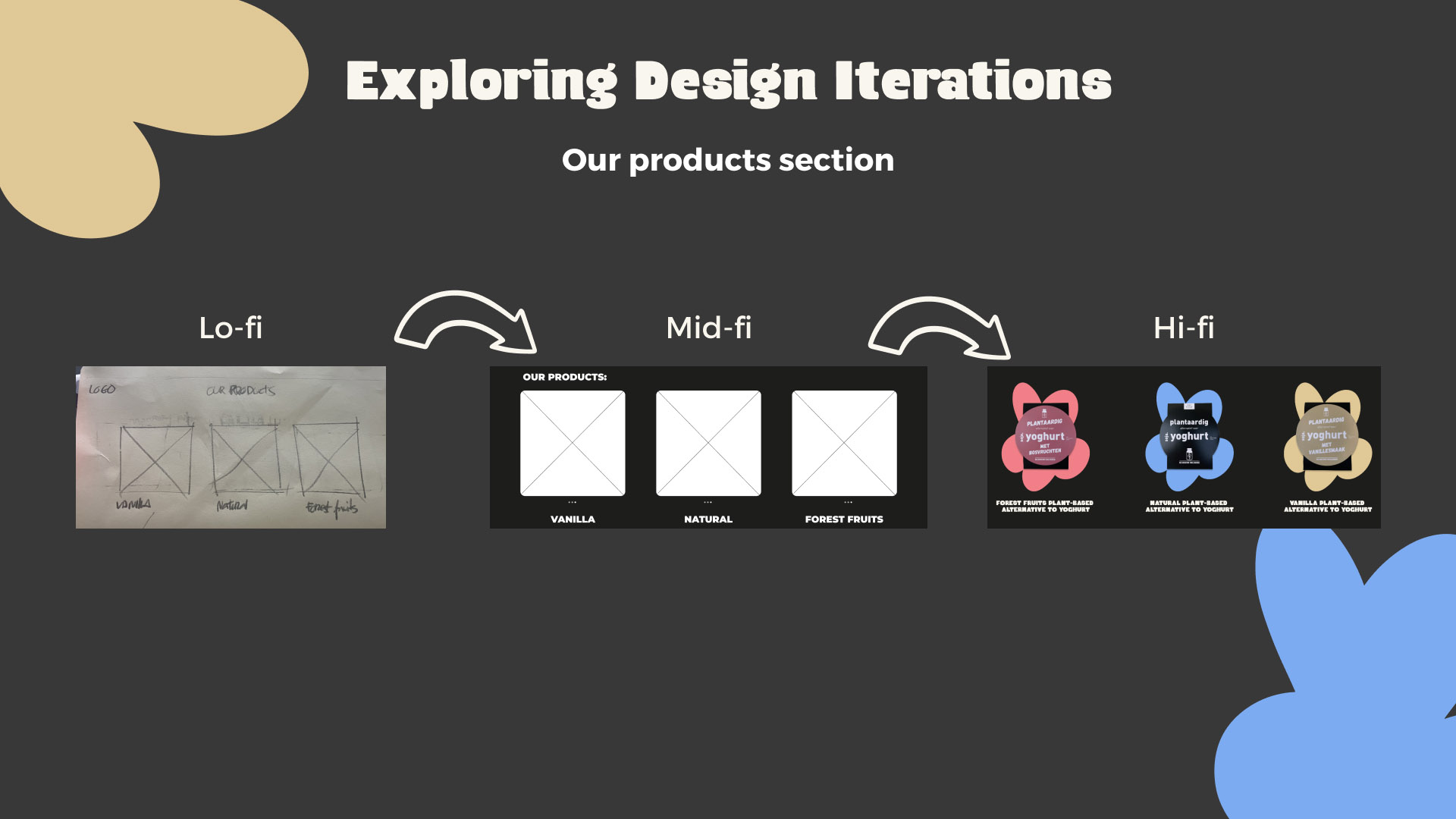
Mid-fi ‘Design Critique’ version
Hi-fi Design parts and Prototype version
How can we effectively implement and test the design?

Implementation and testing
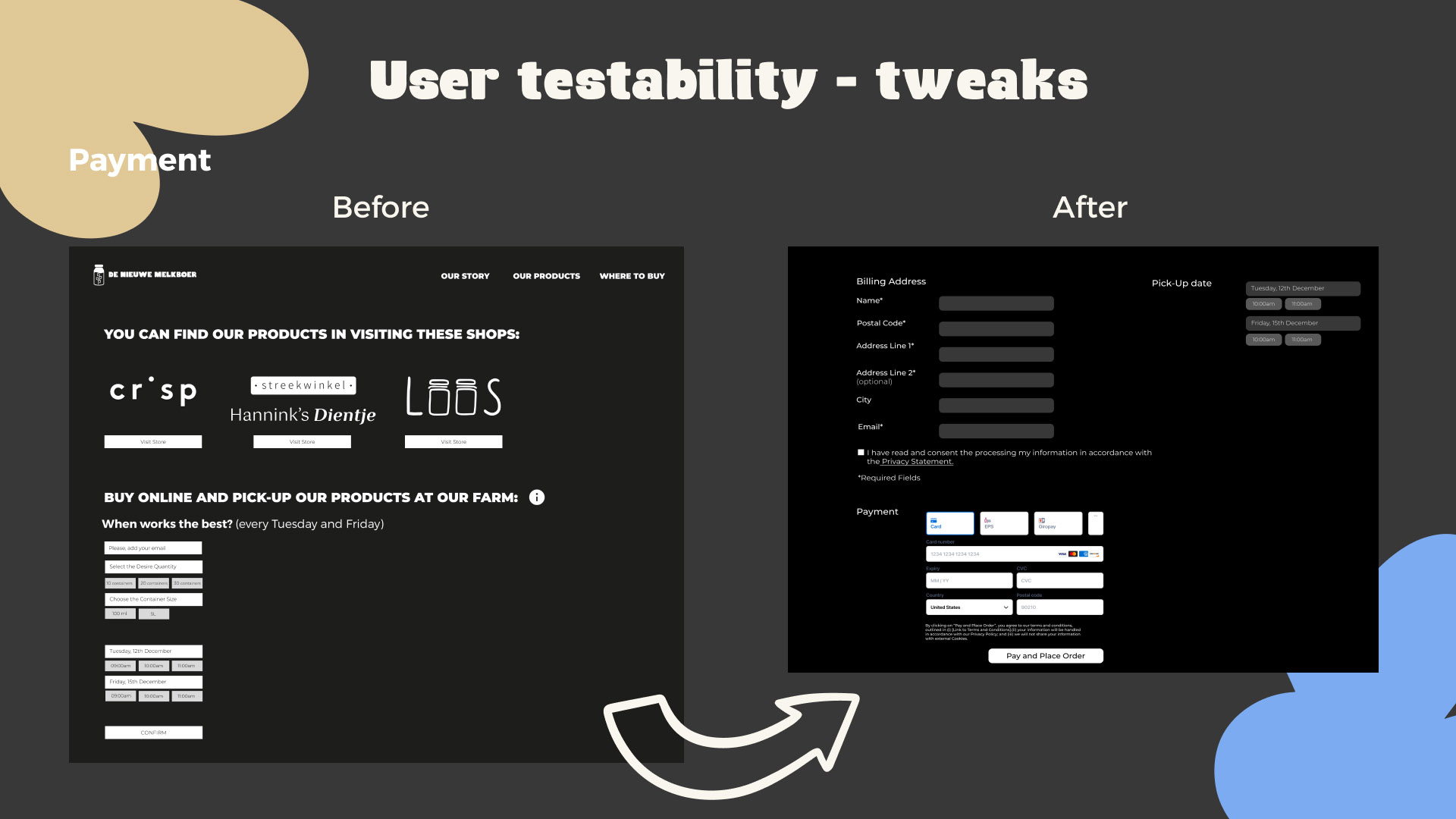
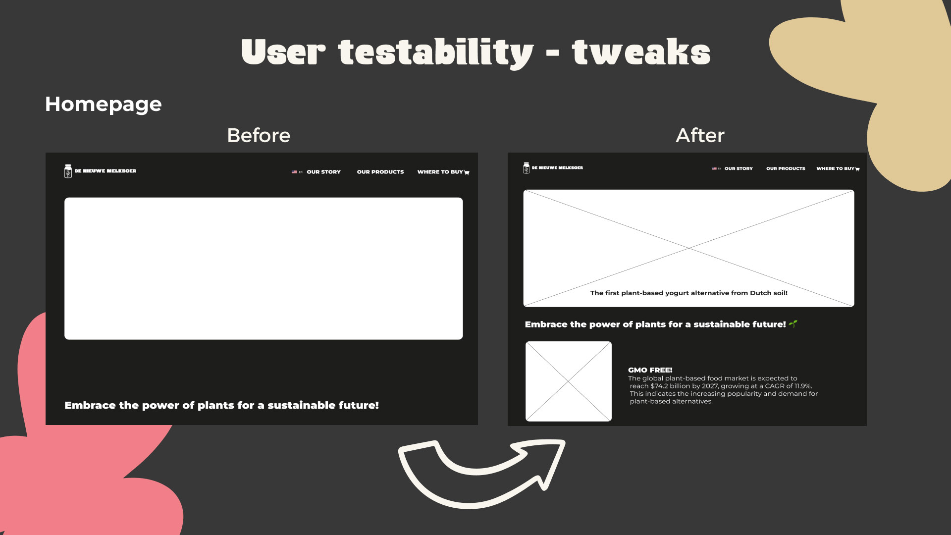
During our design sprint project, we implemented our design in prototype form, using agile methodologies. Iterations based on user feedback allowed us to continuously make improvements and adapt our design to the needs of our users. One concrete finding was that users needed intuitive navigation and clear call-to-action buttons to improve their experience.
During testing, we applied several methods to measure the effectiveness of our design. We conducted user testing, making observations of users’ interactions with the prototype and collecting their feedback. One specific finding was that the addition of visual cues helped users find important functions and increase engagement.
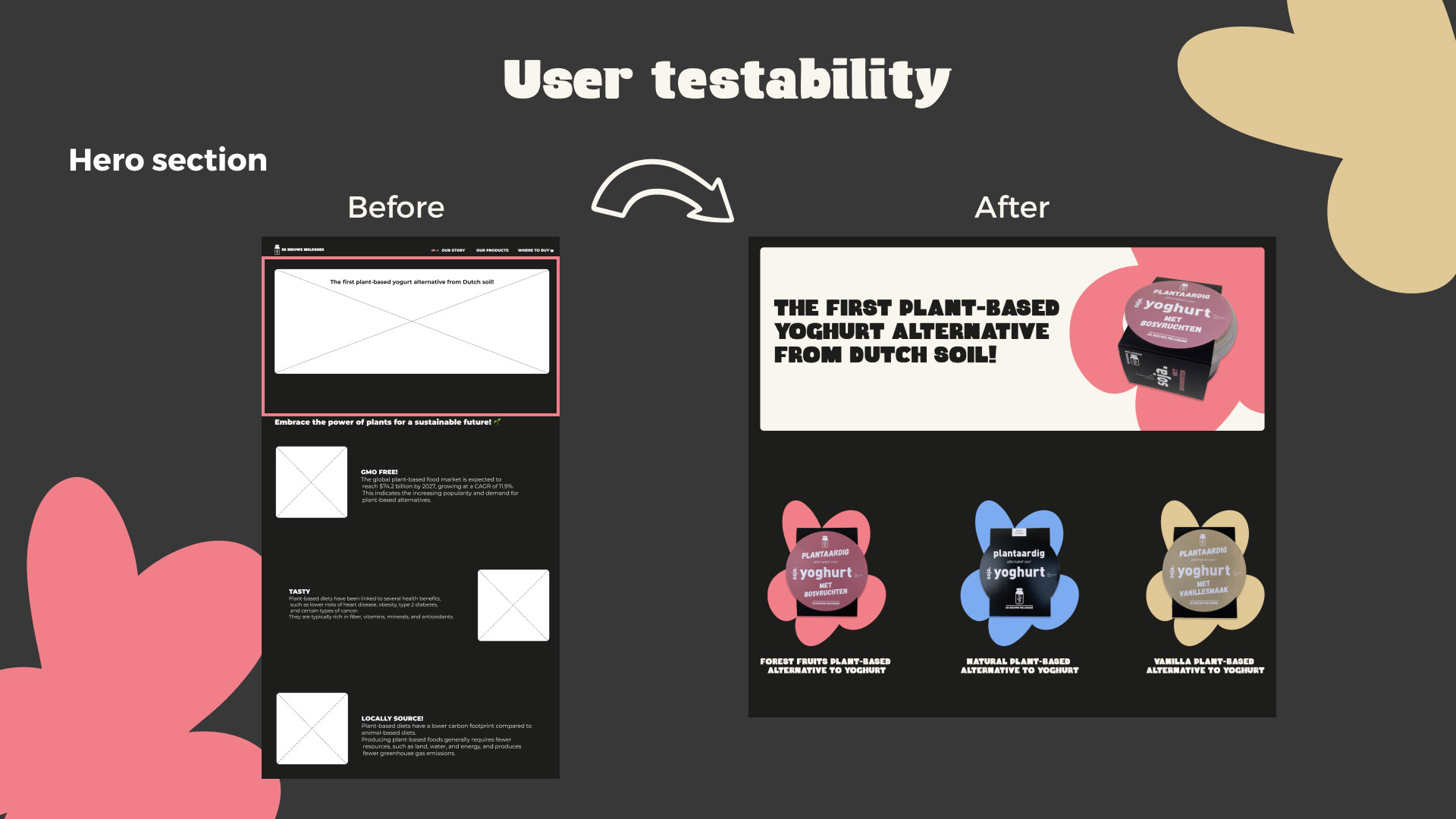
By conducting before-and-after comparisons, we could clearly see which improvements our design had delivered and which aspects required further adjustments. For example, during mid-fi user testing, we found that the redesigned checkout page resulted in a significant drop in the number of abandoned transactions, which showed that users could now more easily navigate through the ordering process.
One of the key insights we gained during testing was the importance of an intuitive user experience. Users appreciated the easy navigation and clear presentation of product information, which resulted in higher satisfaction and engagement.
A response from a user from the tests highlighted the impact of our design: “The new platform makes it so much easier to explore and order The New Milkman’s products. I really like how clear and informative everything is.”
All in all, the implementation and testing process has resulted in a platform that not only meets the expectations of our users, but also contributes to the success of The New Milkman.
In what ways did the developed prototype improve user experience and increase engagement?
Results and impact
Following the project presentation and feedback, we identified improvement opportunities in user experience, including higher engagement and satisfaction. This was supported by positive feedback from user testing and the project presentation, with users praising the intuitive navigation and clear presentation of product information.
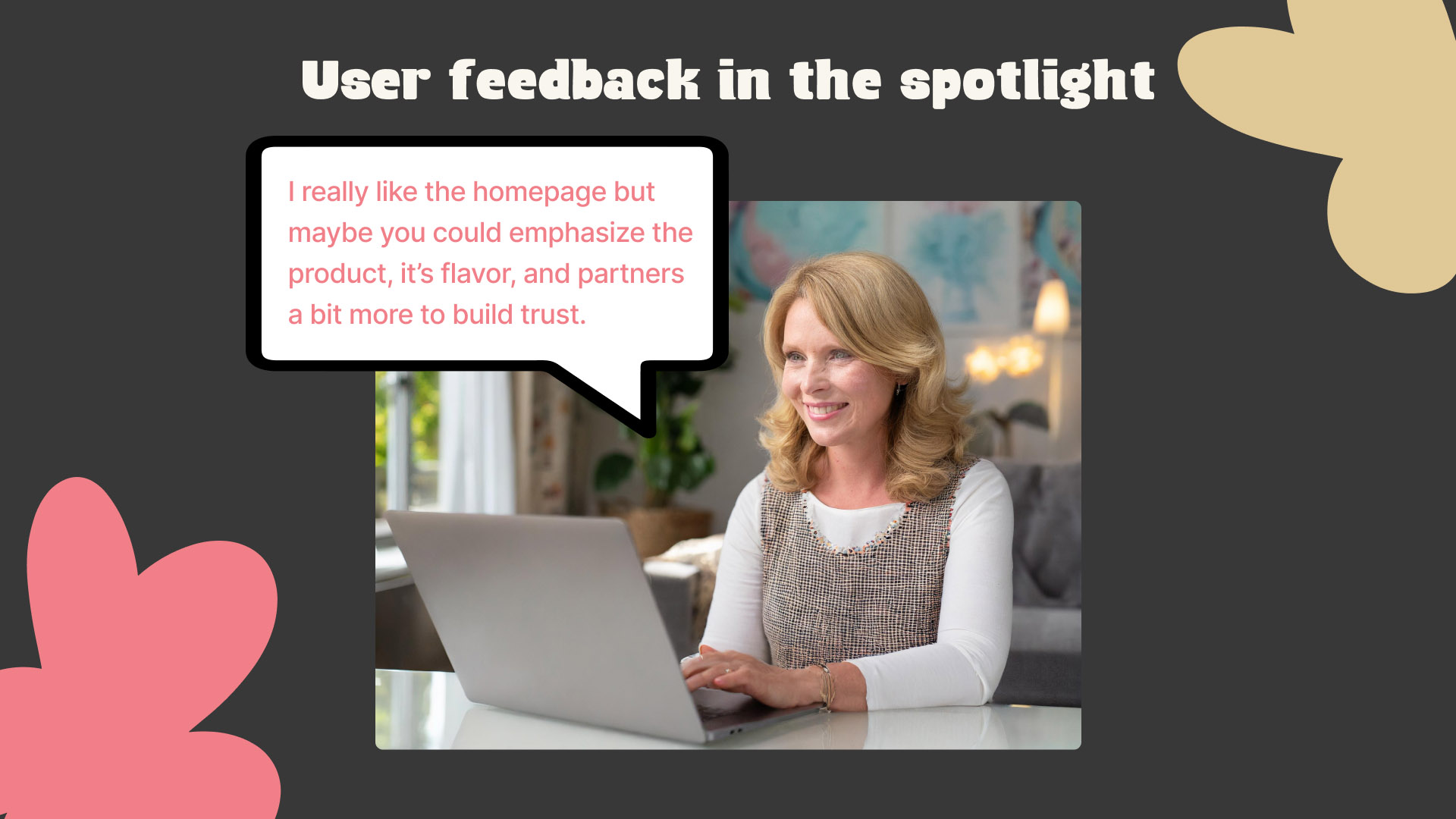
Users appreciate the streamlined website, refreshed layout and the addition of visual cues, which contribute to an enjoyable and interactive experience. The new branding is praised for its contemporary look that stands out among competitors, improving brand perception and increasing user engagement.
Tom Grobben, one of the stakeholders, was extremely positive about the presentation and design. He remarked: “I am hugely impressed with the progress we have made. It is great to see how well the design matches our vision and how it improves the user experience. I can’t wait to work together on the implementation and further development of our platform.”

What are the key insights from our design process and what can we learn from it for the future?
Conclusion
In this case study, we put our focus on strategic thinking, problem solving and creative presentation of design work. The process, including successes, challenges and learning points, has been thoroughly examined. We offer further recommendations for future projects to build on this successful process.
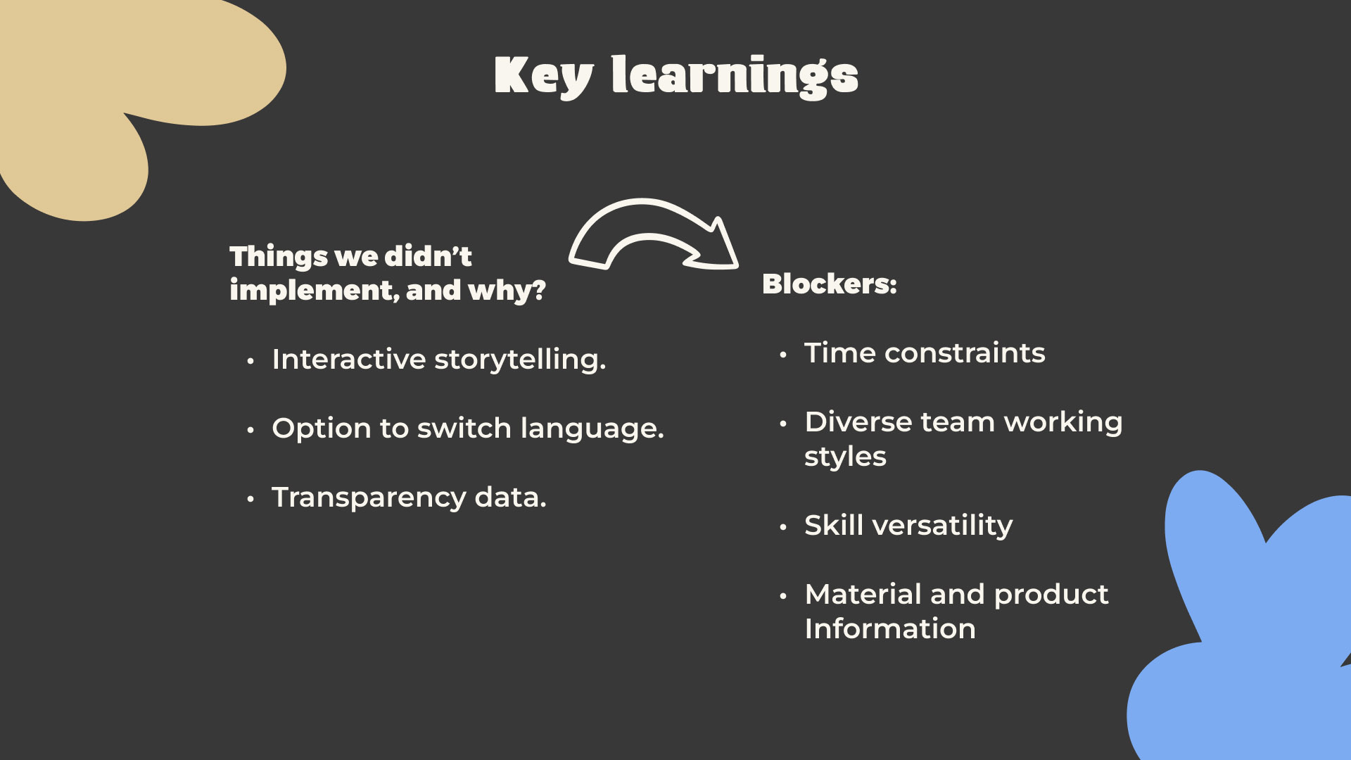
Our process had both successes and challenges. One success was the strategic use of user feedback to make iterative improvements, for example by optimizing navigation based on test results. A challenge was the limited (2 weeks) time, which meant that some desired features, such as interactive stories, could not be implemented (immediately). For future projects, we recommend putting more focus on time management and prioritising features based on feasibility and impact.
How did I take responsibility for improving the visual presentation and prototype?

Ownership in expansion prototype
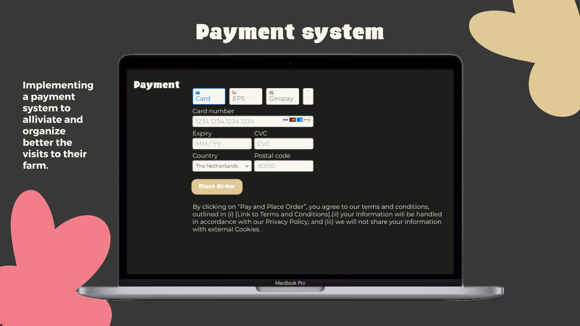
After completing the sprint design project, I independently enhanced our presentation and prototype with additional slides and webpages to provide stakeholders with in-depth explanations on how to successfully implement, test, and measure the impact of this web shop/website. These slides and additional webpages were carefully curated to provide a comprehensive understanding of how the order page works and engagement that the ‘our story’ webpage will achieve.
Check back soon for the latest updates!
Then see how we integrated a ‘click & collect’ system, ‘our story’ page (interactive and engagement), quiz, heatmap/hotjar into the website, and how this created measurable success!
What inspired my choice of The New Milkman?
I chose to collaborate with De Nieuwe Melkboer due to my personal fascination with plant-based nutrition, fuelled by concerns about climate change and a conviction in its health benefits. My interest was ignited by documentaries like “The Game Changers” on Netflix in 2018, alongside discoveries about athletes like Scott Jurek, a Vegan Ultramarathon Runner. Moreover, my upbringing instilled in me a belief in the health advantages of plant-based diets, leading me to follow a plant-based lifestyle for many years.


Ready to take the next step forward?
Thank you for delving into my case study!
Are you intrigued by the potential of user-centric design and ethical practices in design?
Let’s discuss how we can create meaningful experiences together.

